Input field
It gives the user the opportunity to write and send his message.
Overall styling#
- The text-style is basic.
- The line-height is set to default.
- The divider always comes in gray-light and has a height of 1px.
- The background color is basic-white.
- The icon always is paper-plane.svg and it follows the rules of Styling as navigation.
| Types | Attributes | Preview |
|---|---|---|
| Default / active | text-color: gray-darker icon-color: gray-darker | 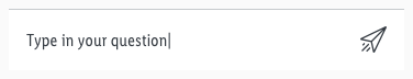 |
| Hover / focus | text-color: brand-primary-base icon-color: brand-primary-base | 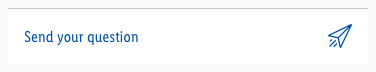 |
| Disabled | text-color: gray-base icon-color: gray-light | 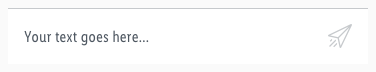 |
Spacing & measurements#
| Types | Attributes | Preview |
|---|---|---|
| Vertical spacing | padding: 16px | 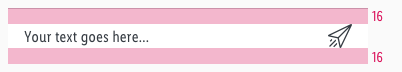 |
| Horizontal spacing | padding: 16px margin: 16px | 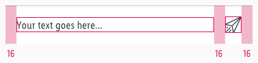 |
| Icon-size | 24x24px clickable area: 56x56px | 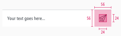 |
Change log#
2.0.0 Chat - 2021-07-22#
Highlights#
Sketch,Doc: "Input field" | New layer-styles, text-styles and color-variables settings
Changed#
Doc: "Input field" | Clean up the documentation for the right structure and sentence case
Fix#
Doc: "Input field" | Fixed links