Grid system
A grid system can be use to align and size objects within a given format.
Usage#
- Basic rules that help you to set up your pages in Sketch.
- The amount, width and spacing of the columns change with the breakpoint.
- The mobile development can independently use its preferred grid system.
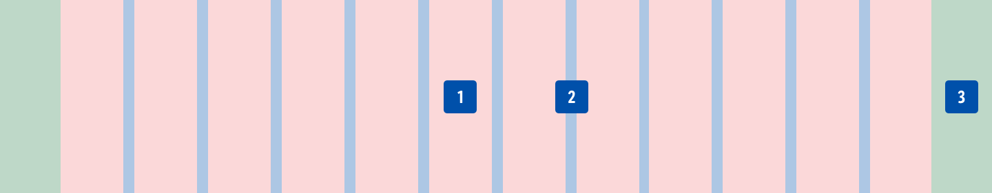
| 1. Columns | 2. Gutters | 3. Margins |
|---|---|---|
| Content is placed in the areas of the screen that contain columns. The number of displayed columns is determined by the breakpoint that is choosen. | Gutters are the spaces between columns. They help separate content and have a fixed value of 16px for phone and tablet. | Margins are the space between content and the left and right edges of the screen. They have fixed values (16px or 32px) for phone and tablet. |
Settings in Sketch#
- There are 4 different artboard sizes.
- There are artboards for phone and tablet view.
Hint! If you need to create the layout on a different device size please stick to the defined gutters and offset. The viewport and columns will then result accordingly.
Phone#
| Artboard | portrait mode | landscape mode |
|---|---|---|
| Viewport | 360px | 640px |
| Columns | 4 columns | 12 columns |
| Gutters | 16px | 16px |
| Offset/Margins | 16px / 16px | 32px / 32px |
| Layout settings | 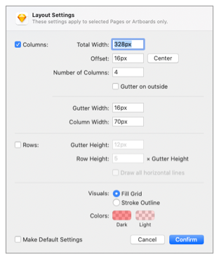 | 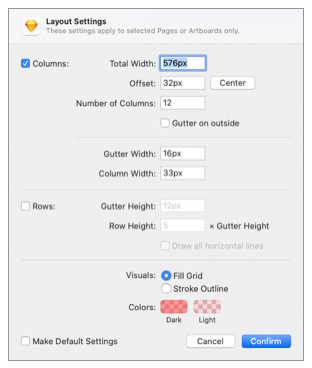 |
Tablet#
| Artboard | portrait mode | landscape mode |
|---|---|---|
| Viewport | 768px | 1024px |
| Columns | 12 columns | 12 columns |
| Gutters | 16px | 16px |
| Offset (Margins) | 32px / 32px | 32px / 32px |
| Layout settings |  | 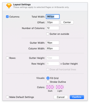 |
Change log#
Changed#
Sketch,Doc: "Grid system" | Changed grid settings
Changed#
Doc: "Grid system" | Clean up the documentation for the right structure and sentence case