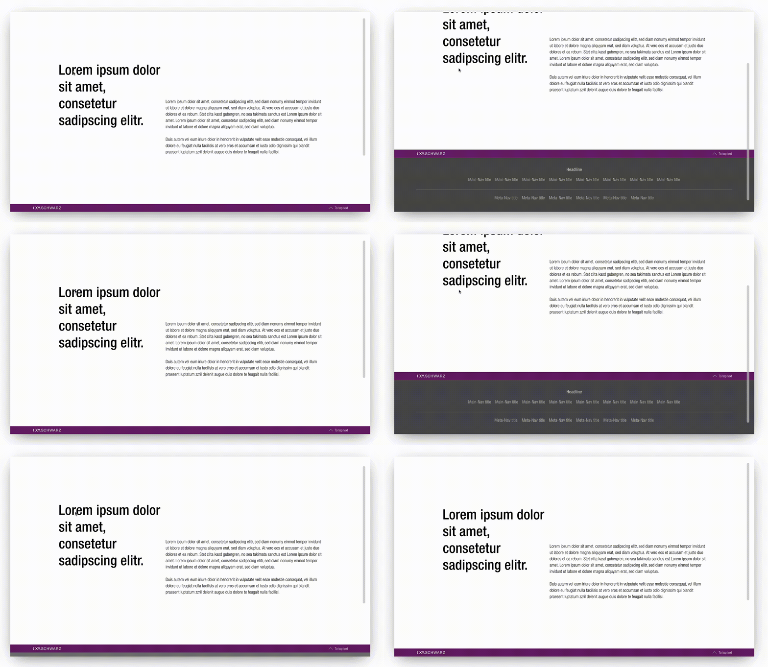
Sticky bar
This element indicates that the user is on a sub-brand page of SCHWARZ Enterprise. It also provides a "back-to-top" scrolling function.
It only exists in combination with our footer and has a fixed order that must be followed at the end of each web page.
Recommendations#
- The sender badge of your sub-brand is available at Schwarz brandmangement.
Elements#
The sticky bar is built from the following elements:
- Background
- Sender badge
- "to top" button
Overall styling#
- Text-style for the "to top"-button-text is always small.
- The line height for the "to top"-button-text is 120%.
- The background-color is always brand-primary-base.
- The icon is always "arrow-up.svg".
States#
- Only the "to top"-button has a hover/focus state.
| Types | Attributes | Preview |
|---|---|---|
| Default | text-color: basic-white icon-color: basic-white |  |
| Hover / focus | text-color: gray-lighter icon-color: gray-lighter |  |
Position#
- It always sticks at the bottom of the viewport as the user scrolls up or down the page.
Spacing & measurements#
- The background expands over the whole screen.
- The sender badge's height scales to the complete element height depending on the viewport.
- Lock the sender badge's ratio to scale it.
Example#
What can be modified?#
- Adjust the width of symbols according to the breakpoint.
Our workflow in Sketch#
- Use the „Overrides“-function to edit the button text and it's state.
Change log#
Changed#
Doc: "Sticky bar" | Clean up the documentation for the right structure and sentence case
Changed#
- "Sticky bar" | Changed symbols: with layer-style settings


