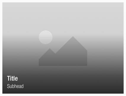
Teaser
Use the teaser component to attract attention and build excitement and expectations through curiosity.
It consists of an image and a text to underline the visual meaning.
Recommendations#
- Use the title and subhead only in a single-line scenario to ensure a good readability and accessibility to avoid low contrast.
- The text will be truncated if too much text is entered.
- Try to keep the 4:3 ratio to guarantee the right display in each breakpoint.
- Otherwise it’s ratio is completely free adjustable.
Overall styling#
- The title uses the text-style large-bold.
- The subhead comes in the text-style basic.
- The line-height is always 120%.
- The title and and the subhead text-color is basic-white.
- The image is overlayed by a gradient with a default-color in basic-black.
- The gradient uses hard-light as a background-blend-mode.
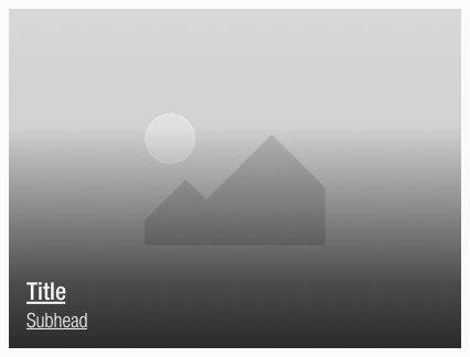
- When a teaser is hovered, the text is underlined and the curser turns into a pointer.
Spacing & measurements#
| Types | Attributes | Preview |
|---|---|---|
| Horizontal spacing | padding: 16px | 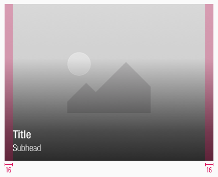 |
| Vertical spacing | padding: 16px distance: 2px | 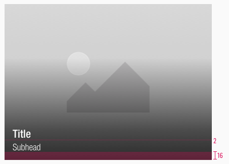 |
| Size | default size of 4:3 | 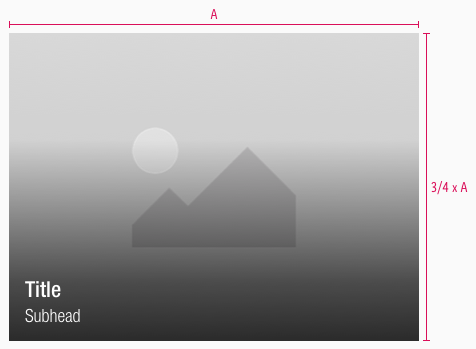 |
| Gradient | the image is overlayed with a gradient | 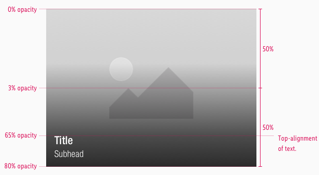 |
What can be modified?#
- Override the text.
- Adjust the ratio to any size.
Our workflow in Sketch#
- Use the "Overrides" function to customize the teaser.
Change log#
Changed#
Doc: "Teaser" | Clean up the documentation for the right structure and sentence case


