Bottom bar
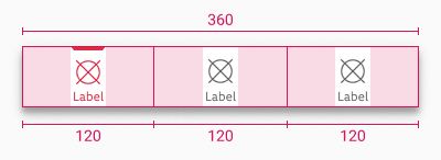
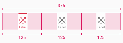
Both Android and iOS bottom bars contain navigation options between the three to five top-level destinations in the app.
Recommendations#
- It should always be positioned at the bottom of each screen.
- All the destinations inside the bar should be of the same importance.
Anatomy#
Android#
Indicator
Icon in active state
Label in active state
iOS#
Indicator
Icon in active state
Label in active state
Divider (hairline)
Overall styling#
Android#
- The label uses the text-style small.
- The line-height is default.
- The icon con size is 24x24px.
- Label text has always one line.
- Elevation shadow is always 8dp.
iOS#
- The title uses the text-style extra small.
- The line-height is 120%.
- The icon con size is 24x24px.
- Divider at the top has 0.5px width.
- Label text has always one line.
Variants#
- Android and iOS bottom bars support both light and dark mode and can have between three to five destinations.
Android variants#
iOS variants#
Spacing & measurements#
Android spacing#
iOS spacing#
What can be modified?#
- Override the text and icons.
- Adjust the width.
Our workflow in Figma#
- Use the light or dark mode bottom bar with desired number of destinations.


