Sheet
A sheet is a component which is used to present a modal view where information and actions related to the parent view are available to the user.
Android modal bottom sheet#
- It should always be used with an overlay screen, unless used in a map-like context where user needs to retain the ability to navigate the screen view.
- User exits the view by swiping the sheet down or by tapping outside the sheet.
- User enlarges the view by swiping the sheet upwards and the screen then transforms into a full screen modal.
- Grabber and title are optional.
- Keep the modal title short, long modal title names will be end up with an ellipsis.
- The modal title always has one-line.
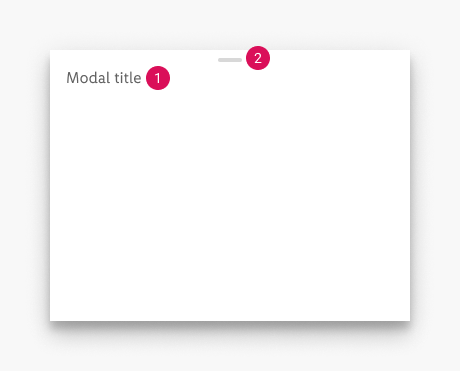
Anatomy of Android modal bottom sheet#
- Modal title (optional)
- Grabber (optional)
☀ Light mode styling for Android#
| Attributes | Modal bottom sheet | Full screen modal |
|---|---|---|
| text-color: greyscale/light-mode/general/medium-contrast grabber-color: greyscale/light-mode/general/extra-low-contrast background-color: basic/white shadow: Android-light-mode/16dp | 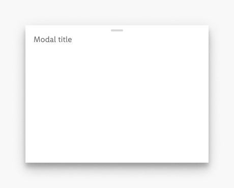 | 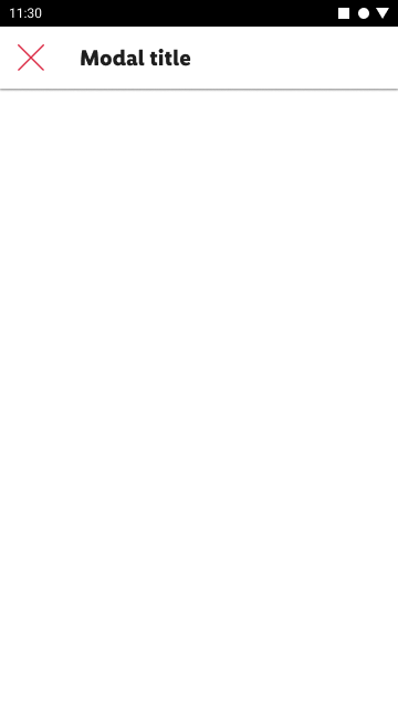 * For attributes take a look at top bar. |
☾ Dark mode styling for Android#
| Attributes | Modal bottom sheet | Full screen modal |
|---|---|---|
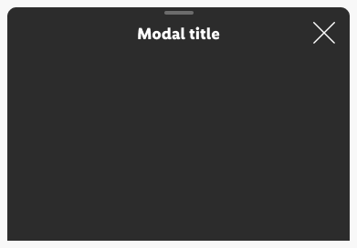
| text-color: greyscale/dark-mode/general/medium-contrast grabber-color: greyscale/dark-mode/general/low-contrast background-color: greyscale/dark-mode/background/Android/16dp shadow: Android-dark-mode/16dp | 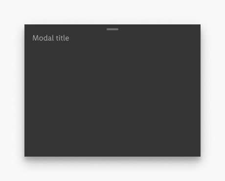 | 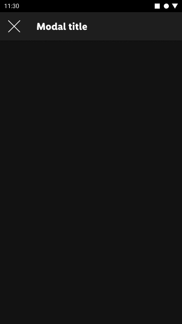 * For attributes take a look at top bar. |
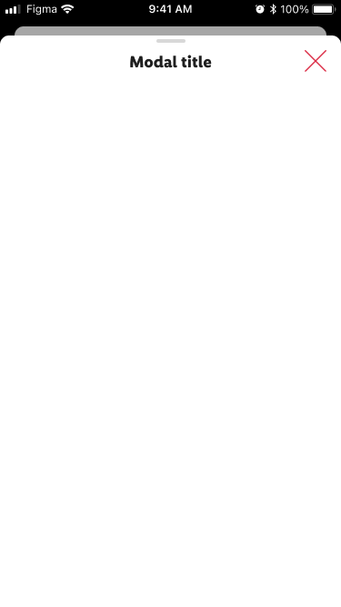
iOS modal bottom sheet#
- It should always be used with an overlay screen, unless used in a map-like context where user needs to retain the ability to navigate the screen view.
- User exits the view by tapping the "X" icon, swiping the sheet down or by tapping outside the sheet.
- User enlarges the view by swiping the sheet upwards and the screen then transforms into a full screen modal.
- Grabber and icons are optional.
- Text buttons can be used instead of the icons.
- Keep the modal title short, long modal title names will be end up with an ellipsis.
- The modal title always has one-line.
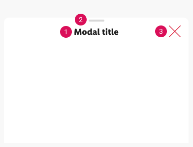
Anatomy of iOS modal bottom sheet#
- Modal title
- Grabber (optional)
- Icon (optional)
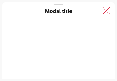
☀ Light mode styling for iOS#
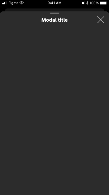
☾ Dark mode styling for iOS#
Spacing & measurements#
Android specs#
| Type | Attributes | Preview |
|---|---|---|
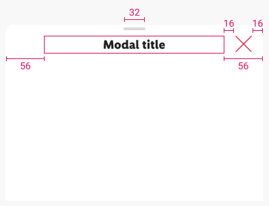
| horizontal | margins: 16px grabber-width: 24px | 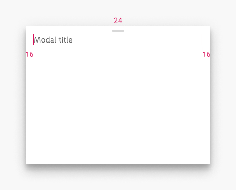 |
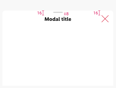
| vertical | margin-top (title): 16px grabber-padding: 8px | 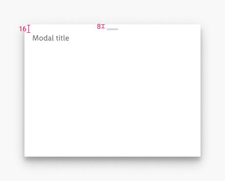 |
iOS specs#
What can be modified?#
- Change the background color.
- Use left and right text buttons if needed (iOS).
- Override the text and icons.
- Hide icons if not needed (iOS).
- Hide grabber if not needed.
- Adjust the width.
2.1.0 Parkside - 2021-11-15#
Added#
Figma,Doc: "Sheet" | Sheet component is available
