Card
- The card component is interactive and its content should be easy to scan.
- It has a clear hierarchy of how different elements should be placed.
Overall styling
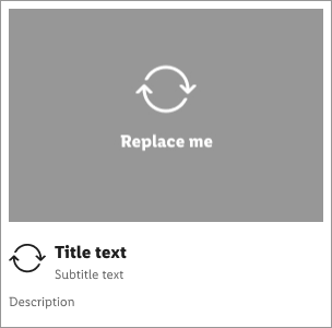
- The title text-style is basic bold.
- The subtitle and description text-style is small.
- The line-height is set to default.
- Images have a global ratio of 4:3.
Recommendation#
- Title and subtitle text length should be one line only.
- Description text length shouldn't be longer than three lines.
| Elements | Preview |
|---|---|
| 1. Image 2. Icon (optional) 3. Title (Title text + subtitle text) 4. Description (optional) 5. Card background surface | 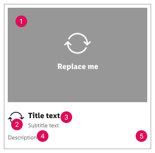 |
Elements#
☀ Light mode styling#
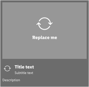
☾ Dark mode styling#
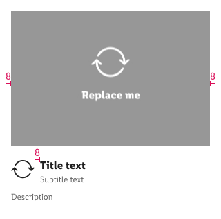
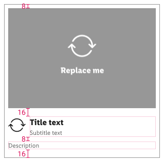
Spacing & measurements#
What can be modified?#
- Override the text.
- Adjust the width of single symbols according to the width of the device.
- Override the icon or delete it.
Change log#
2.0.0 Parkside - 2021-11-02#
Changed#
Doc,Figma: "Card" | Changed background color


