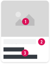
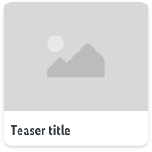
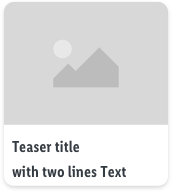
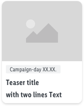
Campaign teasers
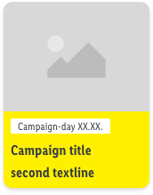
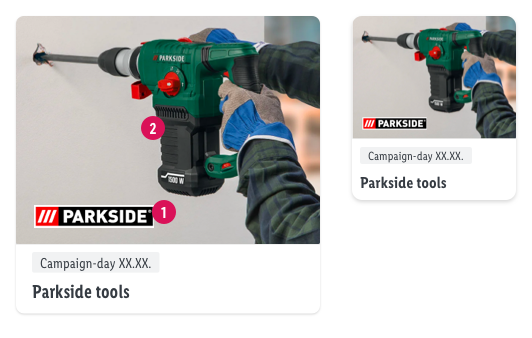
- retail Teasers also have a small badge to communicate the campaign period
- don't include dates in the onlineshop section (exception yellow teaser may have an expire date)
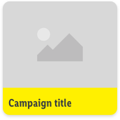
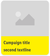
- maximum amount of characters for the title: 22 (amount is based on the smallest viewport XS → this results in a two-line title)

 Campaign Image#
 Offer date#
 Title#
Assets / Campaign Images#
- image ratio: 4 to 3
- Important part of image should be in the image center
- Image 2 and 4 are slightly cropped on LG – make sure to consider safe zone. Find psd template attached.
| Campaign teasers (online shop) | with two lines | Campaign teasers (Retail) |
|---|
 |  |  |
highlight (long term campaigns)#
| highlight | with two lines | with expire date (optional) |
|---|
 |  |  |
- the yellow special teaser is used for longterm campaigns, such as "X-Mas", "Black Friday", etc… → it's not meant to highlight certain regular campaigns
- the yellow teaser only exists in yellow
Recommendations of Use – Do's and Dont's#
Here you find the most important Do's and Dont's of how to use/create campaign teasers.
The majority of our Lidl customers (60% and growing) visits our websites with their mobile devices. So it is strongly recommended to edit and manage all content to fit best on mobile devices. Mobile first is the message!
Responsive behavior of images#
| Dos | Don'ts |
|---|
 |  |
 If you want to display signets or brand logos you should take care that this elements are big enough to ensure that it is also visible on small devices If you want to display signets or brand logos you should take care that this elements are big enough to ensure that it is also visible on small devices Take it simple while creating campaign images and don't overwhelm your Customers with too many elements or text. Take it simple while creating campaign images and don't overwhelm your Customers with too many elements or text.
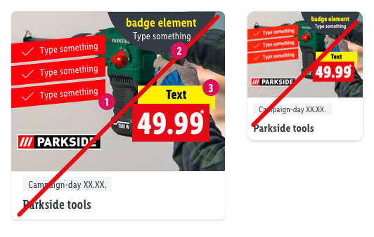
|  don't place text or elements (labels, badges, signets, etc.) on the image. Mostly they won’t be readable and more importantly accessible. don't place text or elements (labels, badges, signets, etc.) on the image. Mostly they won’t be readable and more importantly accessible. Be aware that using elements from the print campaigns can cause problems in terms of accessibility/readability legal requirements for websites. We recommend to adjust these elements for the web Be aware that using elements from the print campaigns can cause problems in terms of accessibility/readability legal requirements for websites. We recommend to adjust these elements for the web due to legal requirements priceboxes are not allowed to be integrated into a teaser image. due to legal requirements priceboxes are not allowed to be integrated into a teaser image.
|
Clear image communications#
| Dos | Don'ts |
|---|
 |  |
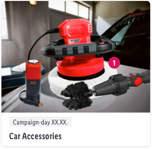
 If your campaign teaser will link to a category/subcategory or campaign page, it is recommended that your teaser image is focusing on a generic group of products. The images should be kept more general in order to ensure the expectation of an promotion page. This can be achieved, for example, with more than one product shown or general topics. If your campaign teaser will link to a category/subcategory or campaign page, it is recommended that your teaser image is focusing on a generic group of products. The images should be kept more general in order to ensure the expectation of an promotion page. This can be achieved, for example, with more than one product shown or general topics.
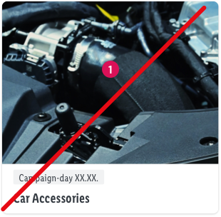
|  Avoid using zoomed-in or cropped images of products as they are often not properly recognized by users. Avoid using zoomed-in or cropped images of products as they are often not properly recognized by users. |
Campaign image & campaign title/descriptions#
| Dos | Don'ts |
|---|
 |  |
 If your campaign teaser will link to a category/subcategory or campaign page, it is recommended that your teaser image is focusing on a generic group of products. The images should be kept more general in order to ensure the expectation of an promotion page. This can be achieved, for example, with more than one product shown or general topics. If your campaign teaser will link to a category/subcategory or campaign page, it is recommended that your teaser image is focusing on a generic group of products. The images should be kept more general in order to ensure the expectation of an promotion page. This can be achieved, for example, with more than one product shown or general topics. keep title short, clear and self-explanatory keep title short, clear and self-explanatory- make sure that title and image fit together. Example issue from user test: Users thought they could book a holiday in Greece. A better title would have been: Specialities from Greece
- Onlineshop Tab: Don't use short keywords only (e.g. kitchen) – users will misinterpret these teasers as category
- Store Tab: Compared to the onlineshop titles, in store context titles like Swimwear, Fruits & Vegetables are easier to understand
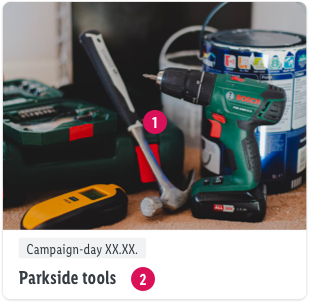
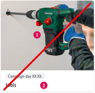
|  When you want to promote a group of products such as "tools", it is confusing for many users when the campaign image only shows one single product When you want to promote a group of products such as "tools", it is confusing for many users when the campaign image only shows one single product- avoid missleading images (e.g. food on plate when plate is sold) to ensure that users won’t expect food offers.
 This misleading is mostly a combination of campaign image and campaign title/descriptions This misleading is mostly a combination of campaign image and campaign title/descriptions
|
All elements of campaign teasers should fulfill the guidelines of the WCAG
- baymard.com/blog/avoid-these-ecommerce-graphics
- Evaluation of customer survey - Hero Teaser
 Campaign Image#
 Campaign Image#
 Offer date#
 Offer date#
 Title#
 Title#