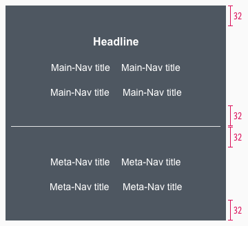
Footer
Use the footer to help the customer with additional information and navigation at the bottom of a website.
Recommendations#
- Keep the footer as short as possible. Do not load it with unnecessary information. The customer is interested in a first glance.
- Ideally, important links will be opened via a new window or a tab in the browser.
Elements#
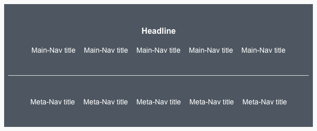
The default footer contains the following elements:
- Headline
- Main-Navigation
- Meta-Navigation
- Divider
- Background
Usage of elements#
| Headline | Main-Navigation | Meta-Navigation |
|---|---|---|
| This element is not absolutely necessary for the setup of a footer, unless you want to title or organize your main-navigation categories. | Use it to show a summary of all possible links or menus on a LIDL website (i.e. sitemap, wishlist, shopping cart, account, ...). | For information, such as legal (imprint, terms and conditions, data protection, ...) or contact, which must be placed on a website. |
Overall styling#
- The headline is large bold and the main-nav title/meta-nav title is basic.
- The line-height is set to default.
- The text-color always is basic-white.
- The background-color is always gray-base.
- The divider width depends on the breakpoint but has always a height of 1px and the color gray-lighter.
- There is no hover, active oder disabled status.
| Types | Attributes | Preview |
|---|---|---|
| Headline | text-style: large bold |  |
| Main-Navigation | text-style: basic |  |
| Meta-Navigation | text-style: basic |  |
Status styling#
| Types | Attributes | Preview |
|---|---|---|
| Main-Nav title | text-style: basic text is underlined background-color: gray-darker |  |
| Meta-Nav title | text-style: basic text is underlined background-color: gray-darker |  |
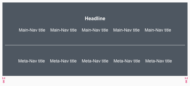
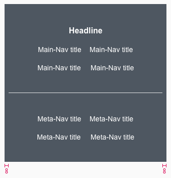
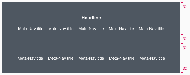
Spacing & measurements#
Our workflow in Sketch#
- All variants are detachable and their arrangement can be changed.
- Combine the individual elements in Sketch to get the footer in various forms and for each breakpoint.
- Use the „Overrides“-function to edit the content of the symbols:
- headline
- main-navigation
- meta-navigation
Change log#
3.0.0 Mail - 2022-05-30#
Changed#
Sketch: "Footer" | Adapted component to new grid settings
2.0.0 Mail - 2022-05-03#
Changed#
Sketch: "Footer" | Adapted component to new grid settings
1.1.0 Mail - 2021-07-22#
Changed#
Doc: "Footer" | Cleaned up the documentation for the right structure and sentence case
1.0.0 Mail - 2021-06-24#
Highlights#
Sketch: "Footer" | New layer-styles, text-styles and color-variables settings
Changed#
Doc: "Footer" | Updated documentation
1.0.0-beta.2 - 2020-01-16#
Changed#
- "Footer" | Changed symbols to new smart layout of Sketch
