Typography
Arial is a system font that can be used without any risk of failure.
Typefaces#
- All types of headings should primarily be used in single line scenarios.
- Use any base color of brand-primary, danger, success, info or warning as text color as long as it has a high contrast ratio in interaction with backgrounds.
Arial#
"Arial is an extremely versatile family of typefaces which can be used with equal success for text setting in reports, presentations, magazines etc, and for display use in newspapers, advertising and promotions."
Quote: Microsoft Typography Font Arial
Small#
- The typeface is always regular.
- The line-height always is 140%.
- It is mainly used, i. e. for labels, highlights.
Small bold#
- The typeface is always bold.
- The line-height always is 140%.
- It is mainly used, i. e. for labels, highlights.
Basic#
- The typeface is always regular.
- The line-height always is 140%.
- It is mainly used, i. e. for body text, tables, lists, etc.
Basic bold#
- The typeface is always bold.
- The line-height always is 140%.
- It is mainly used, i. e. to highlight single words, paragraphs.
Large#
- The typeface is always regular.
- The line-height always is 140%.
- It is mainly used, i. e. for headlines, highlights.
Large bold#
- The typeface is always regular.
- The line-height always is 140%.
- It is mainly used, i. e. for headlines, highlights.
Button text#
- The typeface is always bold.
- The line-height is 120%.
- The text style is only used in our button component.
Label text#
- The typeface is always regular.
- The line-height is 120%.
- The text style is only used in our label component.
Page headlines#
- The typeface is always bold.
- The line-height always is 120%.
- The page headlines are displayed in 5 levels.
- All levels have different font sizes.
- There are fixed font sizes from level 5 to level 1.
| Text style | Font size | Preview |
|---|---|---|
| Page headline (Level 1) | 28px |  |
| Page headline (Level 2) | 24px |  |
| Page headline (Level 3) | 20px |  |
| Page headline (Level 4) | 16px |  |
| Page headline (Level 5) | 14px |  |
Section head#
- The typeface is always bold.
- The line-height always is 120%.
- Section head has only one size and font.
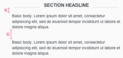
- The text of a section headline is always centered on the screen.
- It is always bold and uppercase.
Pricebox#
- The typeface is always bold.
- The line-height is 100%.
Addon#
- These font sizes are only used for additional text of our pricebox, i.e. prefix, currency, recommended retail price (rrp).
Basic quantity#
- These font sizes are only used for the basic quantity text of our pricebox.
- The line-height is 120%.
Price#
Label#
Lists#
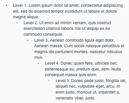
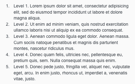
- Lists are used for text structuring.
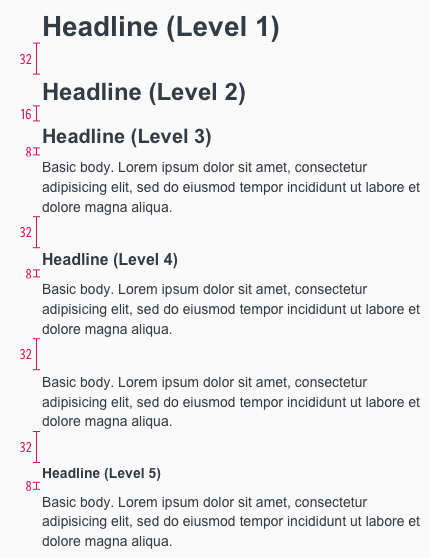
Spacing & measurements#
Our workflow in Sketch#
- All text styles are included in our CAKE UI Mail library.
- Use only these styles!
Change log#
1.1.0 Mail - 2021-07-22#
Changed#
Doc: "Typography" | Clean up the documentation for the right structure and sentence case
1.0.0 Mail - 2021-06-24#
Highlights#
Sketch,Doc: "Typography" | New Arial font has replaced Trebuchet MS and pricebox text styles have been introduced
Added#
Doc: "Typography" | Lists, spacings and measurements have been described
Removed#
Sketch,Doc: "Energy label" | Removed energy label as a text-style, symbol in Sketch and documentation.


