Teaser
Use the teaser component to attract attention and build excitement and expectations through curiosity.
Recommendations#
- The teaser is a placeholder element that is placed in the appropriate size.
- The teaser and it’s look are determined by content.
- The font of the teaser is maintained in the image.
- The teaser arrangement can be freely adjusted and combined.
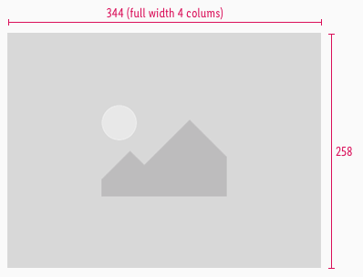
- Try to keep the 4:3 ratio for teasers to guarantee the right display in each breakpoint.
- Otherwise it’s ratio is completely free adjustable.
Overall styling#
- The image has a free ratio.
- The image should be divisible by 8.
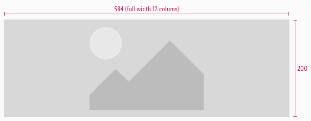
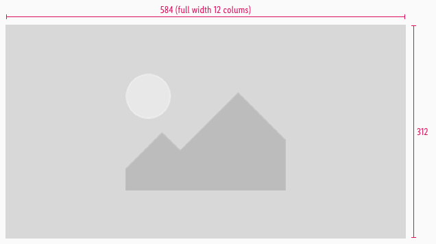
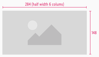
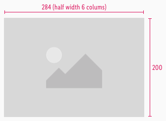
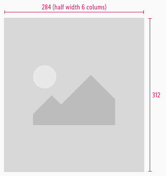
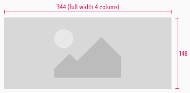
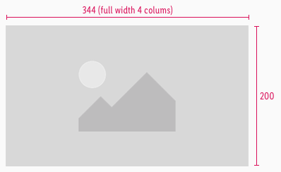
- The teasers are provided in 3 heights for every breakpoint 148px, 200px, 312px.
- Only in tablet view the teasers are povided in full width and half width.
Spacing & measurements#
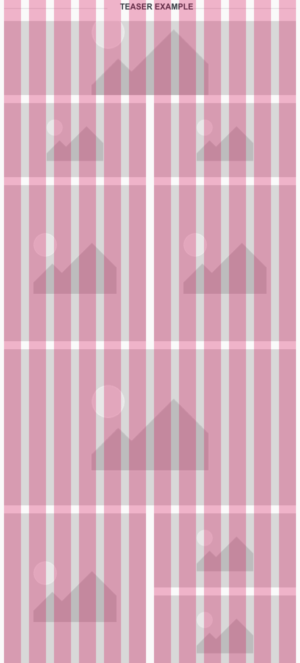
- In the tablet view (SM) it is possible to place the teasers in four or two columns.
- In the smartphone view (XS) place only one teaser over two column to guarantee a readable view for the user.
Tablet view#
Smartphone view#
Example#
- Following example shows how the different teasers can be arrange in tablet view (SM).
Teaser topic#
Spacing & measurements#
| Types | Attributes | Preview |
|---|---|---|
| Horizontal | padding: 8px | 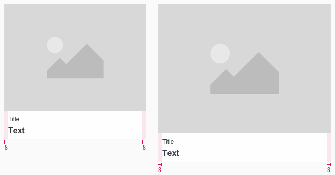 |
| Vertical | padding: 8px distance: 2px | 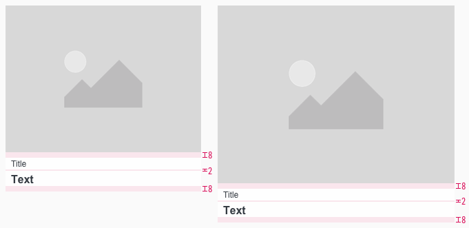 |
| Image ratio | default size of 4:3 |
Our workflow in Sketch#
- Use the "Overrides"-function to change placeholder with the teaser image.
- To change the width of the teaser manually adjust the width of the teaser.
Change log#
3.0.0 Mail - 2022-05-30#
Changed#
Sketch,Doc: "Teaser" | Adapted component to new grid settings
Removed#
Doc: "Teaser" | Removed danger hint text for the spacing and measurements
1.1.0 Mail - 2021-07-22#
Changed#
Sketch,Doc: "Teaser" | Adapted component to new grid settingsDoc: "Teaser" | Cleaned up the documentation for the right structure and sentence case
1.0.0 Mail - 2021-06-24#
Highlights#
Sketch: "Teaser" | New layer-styles, text-styles and color-variables settings
Changed#
Doc: "Teaser" | Updated documentation
Added#
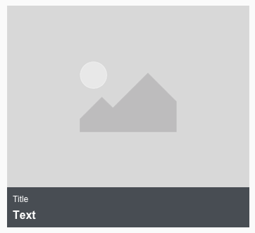
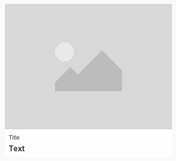
Sketch,Doc: "Teaser" | Added teaser topic in gray and white
1.0.0-beta.2 - 2020-01-16#
Changed#
- "Teaser" | Changed symbols to new smart layout of Sketch

