Trustbar
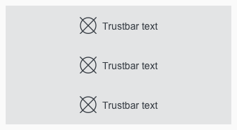
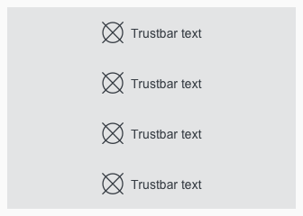
The trustbar is a possibility to show unique selling propositions, services or other outstanding benefits of the company. The standard position on a website is right above the footer.
Recommendations#
- Use only one word or a short single line of text.
- There is no multiline.
- Please ensure that the content meets this requirement.
Overall styling#
- The text-style is basic.
- The line-height is set to default.
- Default states icon- and text-color is gray-darker.
- The background-color always is gray-lighter.
- The hover, focus and active state is also shown in gray-darker but the mouse cursor changes into a link cursor (pointer).
- The icon and text are aligned horizontally and vertically to the center.
Spacing & measurements#
| Types | Attributes | Preview |
|---|---|---|
| Height | SM & XS: 56px |  |
| Width | 4 or 12 colums |  |
| Icon-size | 24x24px | |
| Horizontal spacing | margin: 8px |  |
Variants#
- The width depends on the number of elements but always matches our grid.
- The width of the single trustbar elements adapts to grid.
- The trustbar extends over the entire screen width.
- The minimum version consists of 3 and the maximum version of 4 trustbar elements.
Our workflow in Sketch#
- Change the text or icon by using the "Overrides"-function.
- To delete a not needed tile use the "Overrides"-function. Always delete from bottom to top to avoid gaps in the component.
Change log#
3.0.0 Mail - 2022-05-30#
Changed#
Sketch: "Trustbar" | Adapted component to new grid settings
2.0.0 Mail - 2022-05-03#
Changed#
Sketch: "Trustbar" | Adapted component to new grid settings
1.1.0 Mail - 2021-07-22#
Changed#
Doc: "Trustbar" | Cleaned up the documentation for the right structure and sentence case
1.0.0 Mail - 2021-06-24#
Highlights#
Sketch: "Trustbar" | New layer-styles, text-styles and color-variables settings
Changed#
Doc: "Trustbar" | Updated documentation
1.0.0-beta.2 - 2020-01-16#
Changed#
- "Trustbar" | Changed symbols to new smart layout of Sketch


