Grid System
A grid system can be use to align and size objects within a given format.
Usage#
- Basic rules that help you set up your pages in sketch.
- The responsive behavior of our grid has four breakpoints.
- The amount, width and spacing of the columns change with each breakpoint.
- Exception! The global header and footer live outside the bounds of the grid.
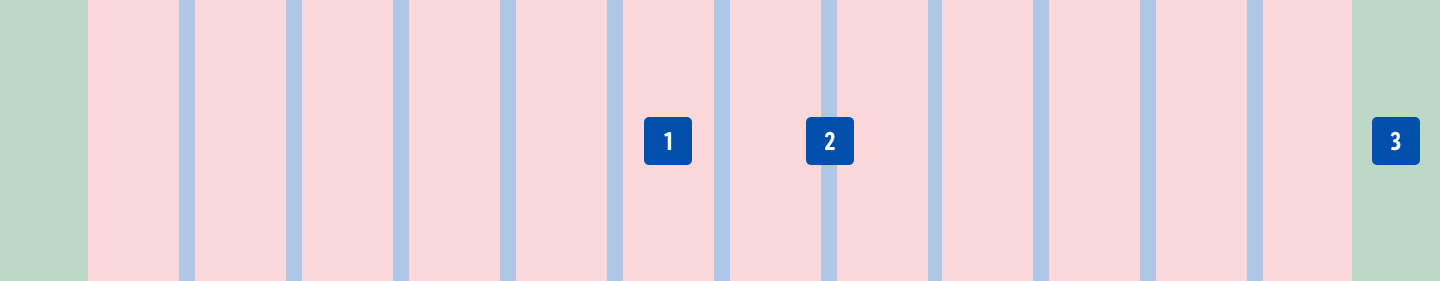
| 1. Columns | 2. Gutters | 3. Margins |
|---|---|---|
| Content is placed in the areas of the screen that contain columns. The number of displayed columns is determined by the breakpoint that is choosen. | Gutters are the spaces between columns. They help separate content and have a fixed value for all breakpoints. | Margins are the space between content and the left and right edges of the screen. They have fixed values for XS and SM breakpoint. |
Design breakpoints#
| XS | SM |
|---|---|
360-599px | 600-959px |
Settings in Sketch#
| Artboard | SM | XS |
|---|---|---|
| Viewport | 600px | 360px |
| Columns | 12 columns | 4 columns |
| Gutters | 16px | 16px |
| Offset (Margins) | 8px / 8px | 8px / 8px |
| Layout settings | 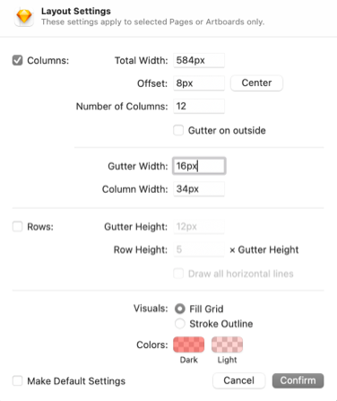 | 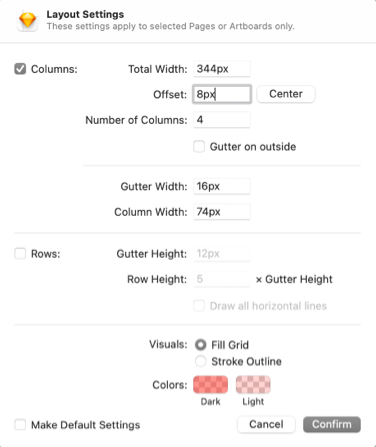 |
Change log#
3.0.0 Mail - 2022-05-30#
Added#
Doc: "Grid system" | Added design breakpoints
Changed#
Sketch: "Grid system" | Changed grid settings
2.0.0 Mail - 2022-05-03#
Changed#
Sketch,Doc: "Grid system" | Changed grid settings