Ribbons
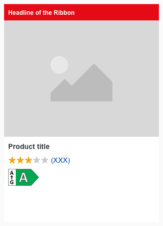
Use ribbons to add unique selling prepositions or other information.
Basically it is positioned in a context with a product tile, teaser, or image.
Overall styling#
- The text-style is small bold.
- The line-height is default.
Recommendations#
- If you decide to use a ribbon, never use more than a maximum of 2 variations
(our "info" ribbon matches our brand-primary color due to the purpose of the color "blue").
Variants#
- The ribbon has 3 colored variations: primary, highlight, gray and info.
Spacing & measurements#
Position#
- The ribbon is placed below the image.
- Several ribbons have no distance to each other at the bottom.
Example#
Our workflow in Sketch#
Use the "Overrides"-function to place the ribbon into the content area of the product tile and to change the text of the ribbon.
Change log#
3.0.0 Mail - 2022-05-30#
Changed#
Sketch: "Ribbon" | Adapted component to new grid settings
2.0.0 Mail - 2022-05-03#
Changed#
Sketch: "Ribbon" | Adapted component to new grid settings
1.3.0 Mail - 2022-02-21#
Changed#
Doc: "Ribbon" | Updated documentation preview assets with new star rating
1.1.0 Mail - 2021-07-22#
Changed#
Doc: "Ribbon" | Cleaned up the documentation for the right structure and sentence case
1.0.0 Mail - 2021-06-24#
Highlights#
Sketch: "Ribbon" | New layer-styles, text-styles and color-variables settings
Changed#
Doc: "Ribbon" | Updated documentation
1.0.0-beta.2 - 2020-01-16#
Changed#
- "Ribbon" | Changed symbols to new smart layout of Sketch


