Header
The header is one of the essential components to create brand awareness.
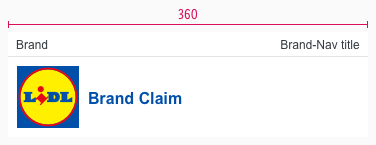
The appearance symbolizes customers that they received a LIDL newsletter. Its strongest supporting element is the LIDL logo with the brand claim.
Recommendations#
- Keep the globally known LIDL Logo in the header.
- Only change the brand claim regarding to your country.
Elements#
- Brand
- Brand-navigation
- Logo
- Brand Claim
- Divider
Usage#
- Use the brand to show a sub slogan or the release date of the newsletter.
- Use the brand-navigation as a link to supporting sites for the newsletter. For example to the newsletter profile of the customer or to a special page that presents LIDL (e.g. FAQ, responsibility, career …).
- Use the brand-claim to promote the newsletter slogan.
- Use the logo to show the user that this is a LIDL newsletter. You can also use the logo as a link to the shop.
Overall styling#
- The text style of brand and brand-navigation is small.
- The text style of the brand claim is page headline (Level 4).
- The line-height is set to default.
- The divider has the color gray-lighter and a height of 1px. The length of the divider is the full width of the component.
- The header comes with a background-color in basic-white.
| Types | Attributes | Preview |
|---|---|---|
| Brand or Brand-navigation | text-style: small text-color: gray-darker |   |
| Brand Claim | text-style: page headline (Level 4) text-color: brand-primary-base position: vertically centered with logo |  |
Spacing & measurements#
| Types | Attributes | Preview |
|---|---|---|
| Height | complete: 105px brand: 25px brand-claim: 80px |  |
| Width | SM: 600px XS: 360px |   |
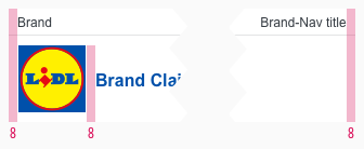
| Padding | padding-left and -right: 8px padding logo and claim: 8px |  |
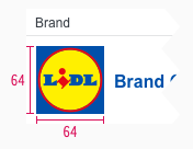
| Logo | size: 64x64px |  |
Our workflow in Sketch#
- Use the overrides to fill it with realistic content and scale the symbol to the right width.
Change log#
3.0.0 Mail - 2022-05-30#
Changed#
Sketch,Doc: "Header" | Adapted component to new grid settings
Removed#
Doc: "Header" | Removed danger hint text for the spacing and measurements
2.0.0 Mail - 2022-05-03#
Changed#
Sketch: "Header" | Adapted component to new grid settings and marked documentation with deviating measurements
1.1.0 Mail - 2021-07-22#
Changed#
Doc: "Header" | Cleaned up the documentation for the right structure and sentence case
1.0.0 Mail - 2021-06-24#
Highlights#
Sketch: "Header" | New layer-styles, text-styles and color-variables settings
Changed#
Doc: "Header" | Updated documentation
