Theme slider
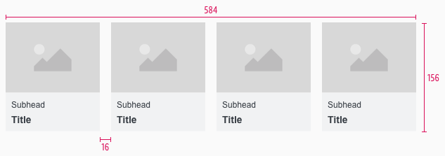
The theme slider is a navigation bar for special offers and topics that should be displayed prominently to the user with pictures.
All offers are listed horizontally next to each other. Sliding of offers is a characteristic feature of this components.
Overall styling#
- The title has the text-style of basic-bold.
- The subheadline comes in the text-style small.
- The line-height is 120%.
- Height and width of the component is divisible by 8.
- The image ratio is always 4:3.
- There is no hover or active state.
Item#
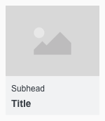
- An item is a single navigation element in the theme-slider that is shown with an image and text.
Spacing & measurements#
- The total height and width of the component is based on the size of the individual elements and their corresponding spacings.
- The width also depends on how many elements are displayed and is always a multiple of 8.
- The padding and gutter always is 8px.
Desktop (SM)#
| Type | Attributes | Preview |
|---|---|---|
| Height | image: 101px text: 55px complete: 156px | 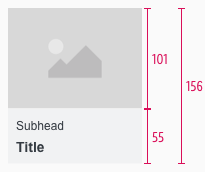 |
| Width | 134px | 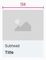 |
| Spacing | padding: 8px margin: 2px | 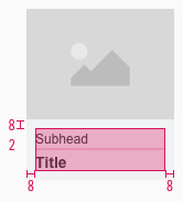 |
Smartphone (XS)#
| Type | Attributes | Preview |
|---|---|---|
| Height | image: 124px text: 55px complete: 179px | 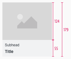 |
| Width | 164px | 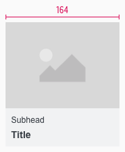 |
| Spacing | padding: 8px margin: 2px | 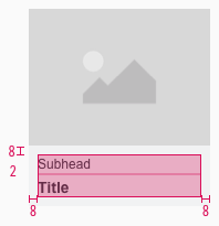 |
Our workflow in Sketch#
- Use the "Overrides"-function to customize the theme slider in the two possible variants or to change the titles or sub-headlines.
- To delete a not needed tile use the "Overrides"-function. Delete always from back to front to avoid gaps in the component.
Change log#
3.0.0 Mail - 2022-05-30#
Changed#
Sketch,Doc: "Theme slider" | Adapted component to new grid settings
3.0.0 Mail - 2022-05-30#
Removed#
Doc: "Theme slider" | Removed danger hint text for the spacing and measurements
2.0.0 Mail - 2022-05-03#
Changed#
Sketch: "Theme slider" | Adapted component to new grid settings and marked documentation with deviating measurements
1.1.0 Mail - 2021-07-22#
Changed#
Doc: "Theme slider" | Cleaned up the documentation for the right structure and sentence case v
1.0.0 Mail - 2021-06-24#
Highlights#
Sketch: "Theme slider" | New layer-styles, text-styles and color-variables settings
Changed#
Doc: "Theme slider" | Updated documentation
1.0.0-beta.2 - 2020-01-16#
Changed#
- "Theme slider" | Changed symbols to new smart layout of Sketch
