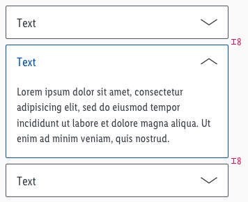
Accordion
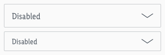
Use an accordion to manage a large amount of content through dynamic switching.
Parts of the content are hidden in a container and only displayed by the user's action.
Overall styling#
- The text-style is basic.
- The line-height is set to default.
- The outline has a 1px thickness.
Accordion#
- The symbol has rounded corners with a 2px radius.
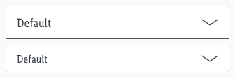
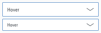
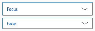
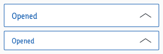
- The default/hover/focus state uses "arrow-down" and the open state use "arrow-up" as an icon.
Content#
- The symbol has rounded corners with a 2px radius on the lower-left and -right corner.
Spacing & measurements#
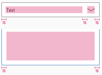
- Width depends on device and usage.
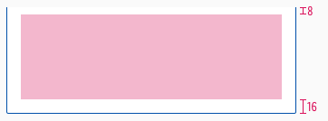
- Only the height for the content symbol is free adjustable.
Measurements#
Spacing#
What can be modified?#
- Override the text.
- Adjust the width.
- Adjust the height but only for the "content" symbol.
- Modify the complete look of the symbol but please stick to the colors of the given states.
Our workflow in Sketch#
- Use the "Overrides"-function to customize your accordion element (i.e. select the correct status you want to display).
- Place the "content" symbol directly under the accordion to display an open status.
Change log#
Changed#
Sketch: "Accordion" | Adjusted to new grid settings
Changed#
Sketch: "Accordion" | Adapted component to new grid settings
Changed#
Doc: "Accordion" | Clean up the documentation for the right structure and sentence case
Added#
- "Accordion" | Added description: Text length ends with ellipsis
Changed#
- "Accordion" | Changed symbols: with radius symbol and layer styles
- "Accordion" | Changed symbols: with layer-style settings
Fixed#
- "Accordion" | Fixed symbols & description: wrong icon description for hover state
Added#
- "Accordion" | Added symbols and description (MD-XS)
