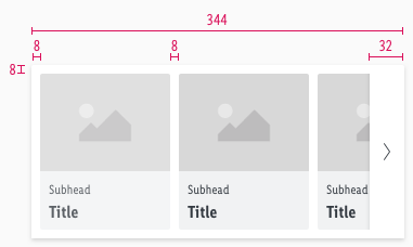
Theme slider
The theme slider is a navigation bar for special offers and topics that should be displayed prominently to the user with pictures.
All offers are listed horizontally next to each other. Sliding of offers is a characteristic feature of this components.
Elements#
- Item
- Background
- Slider Button
Overall styling#
- The title has the text-style of basic bold.
- The subheadline comes in the text-style small.
- The line-height is 120%.
- The background comes in basic-white.
- The whole component uses the shadow-default.
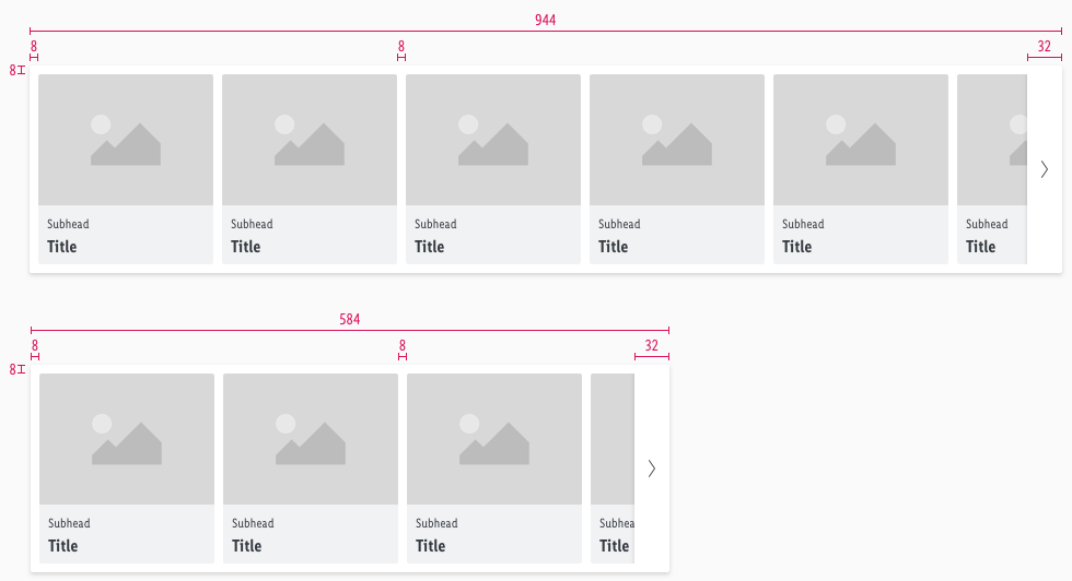
- The width of the component is divisible by 8.
- The image ratio is always 4:3.
- Every component has rounded corners of 2px except the slider button.
States#
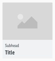
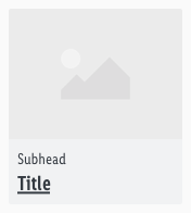
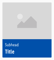
- An item is a single navigation element in the theme-slider that is shown with an image and text.
- The behavior of the slider button can be found in the Slider Button description.
Spacing & measurements#
- The total height and width of the component is based on the size of the individual elements and their corresponding spacings.
- The width also depends on how many elements are displayed and is always a multiple of 8.
- The padding and gutter always is 8px.
- The slider button always has a width of 32px.
Complete#
Item#
| Type | Attributes | Preview |
|---|---|---|
| Horizontal spacing | padding: 8px | 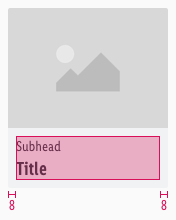 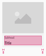 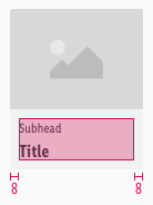 |
| Vertical spacing | padding: 8px margin: 4px | 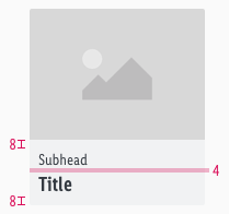 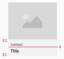 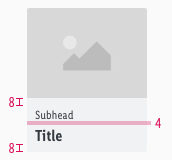 |
| Width | LG: 160px MD+SM: 160px XS: 120px | 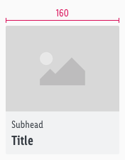 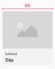 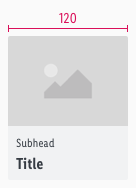 |
What can be modified?#
- Override text and image.
- Modify theme sliders to your project needs by deleting single symbols (i.e. like the tab or slider button symbol).
- Modify theme sliders to your project needs by shortening the complete symbol but please stick to the rule of 8 (i.e. theme slider with 6 items to a width of 1016px in LG).
Our workflow in Sketch#
- Use the "Overrides"-function to customize the theme slider in the three possible variants or to change the titles or sub-headlines.
- Use the "Overrides"-function to hide the slider buttons when they are not needed.
Change log#
Changed#
Sketch,Doc: "Theme slider" | Adjusted to new grid settings
Removed#
Doc: "Theme slider" | Removed danger hint text for the spacing and measurements
Changed#
Sketch,Doc: "Theme slider" | Adapted component to new grid settings and marked documentation with deviating measurements
Changed#
Doc: "Theme slider" | Clean up the documentation for the right structure and sentence case
Changed#
- "Theme slider" | Changed symbols: with layer-style settings
Fixed#
- "Theme slider" | Fixed symbols: missing underline of hover and focus state
Changed#
- "Theme slider" | Changed symbols of items: padding to "8px"; spacing to "4px"
Removed#
- "Theme slider" | Removed description: fixed height of complete symbol and item

