Skeleton
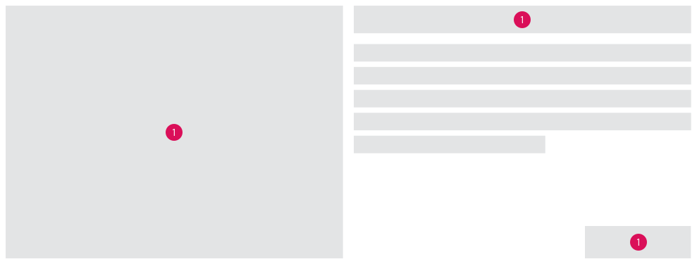
Skeleton screens use a stylized UI to indicate to users that a content is still loading and that they have to wait. The step by step rendering of the loading content conveys a passage of time and in that way ensures a better user experience.
Recommendation#
- Skeleton loaders should be used when pages or sections can be progressively populated with content, such as text and images, as they become available.
- Content should immediately replace each skeleton loader when it is available.
- Instantly loading content does not need a skeleton loader.
- Skeleton screens should not be used as splash screens.
- Motion effects are recommended to decrease the preceived duration time.
- A skeleton screen should not be used in combination with a spinner.
Overall styling#
- Shapes
- Simple shapes without rounded edges represent different content types like text and images and they follow the spacing guidelines.
Motion#
- Basic pulse motion: Shapes filled in gray-lighter have a fade-in and fade-out pulsing motion to indicate that they are being loaded.
- Shimmer effect motion: A two layered, filled shape where the gradient moves from left to right with a slow motion speed and where its animation has a constant duration time.
Implementation of skeleton screen#
Prioritize what type of loading content should be simulated with skeleton loaders.
References#
UID-826 // Skeleton for our gridbox (web)
uxdesign.cc - What you should know about skeleton screens
medium.com - Engaging users with progressive loading in skeleton screen
Highlights#
Doc: "Skeleton" | Skeleton screen guidelines


