Rating
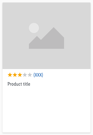
The product rating is visually represented with a star rating.
Recommendations#
- The maximum number of 5 stars can be reached.
- If the product has not yet been rated, no stars will appear.
- The number in the bracket indicates how many users have already submitted a rating.
Elements#
The rating component consists of:
- Stars
- Rating number
Overall styling#
- The text style is basic.
- The line-height is set to default.
- The icon star-fill or star-percentage is used.
Spacing & measurements#
- The height of the rating is 16px.
- The width depends on the number of given ratings in the bracket.
- The rating component changes between LG and MD-XS breakpoint. The star icons remain the same size and only the rating number text style changes according to the basic text style.
Behavior#
The inside of the last star item can be filled from left to right based on percentages. A rating can be interactive (e.g. on product detail page) or static (e.g. on product tile). If the rating is static the rating component has no hover-focus state.
Variants#
Examples#
This is a non-obligatory example of the positioning of the star rating on the product tile.
What can be modified?#
- Override the text and select the status of the stars.
Our workflow in Sketch#
- Use the "Overrides"-function to change the number of stars.
References#
[T16 | Global] Rating Stars
Change log#
Fixed#
Doc: "Rating" | Jumpmark to what can be modified
Highlights#
Sketch,Doc: "Rating" | Component is available with the latest color definitions


