Ad-tag
Ad-tag component shows to the user that certain component is used for advertising purpose. It is part of legal requirements for advertisements.
Overall styling#
- The text-style is small.
- The line-height is set to default.
- The color is set to gray-darker.
Ad-tag#
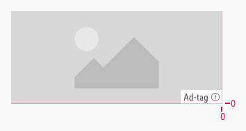
- The symbol has a general basic-white background for image advertisements.
- The background can be changed to the transparent background when it is placed below a component, e.g. recommendation slider.
- The ad-tag with transparency background works only on light backgrounds such as e.g gray-background.
- The expression exclamation-circle is optional for banner elements.
- The expression exclamation-circle is required for Product Listing ads.
- The expression exclamation-circle icon triggers a popover.
- The text-length is limited to a single word only and must be plural if more than one ad is labelled with a single ad-tag.
Spacing & measurements#
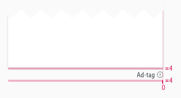
- The ad-tag is always placed on the bottom right area and is right aligned.
Measurements#
| Types | Attributes | Preview |
|---|---|---|
| Horizontal spacing | padding: 4px |  |
| Vertical spacing | padding-top: 0px icon is vertical centered |  |
| Height | LG: 20px MD-XS: 17px | 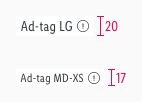 |
| Size | icon: 12x12px |
Spacing#
Examples#
| Position | Preview |
|---|---|
| Image ad |  |
| Reco slider ad | 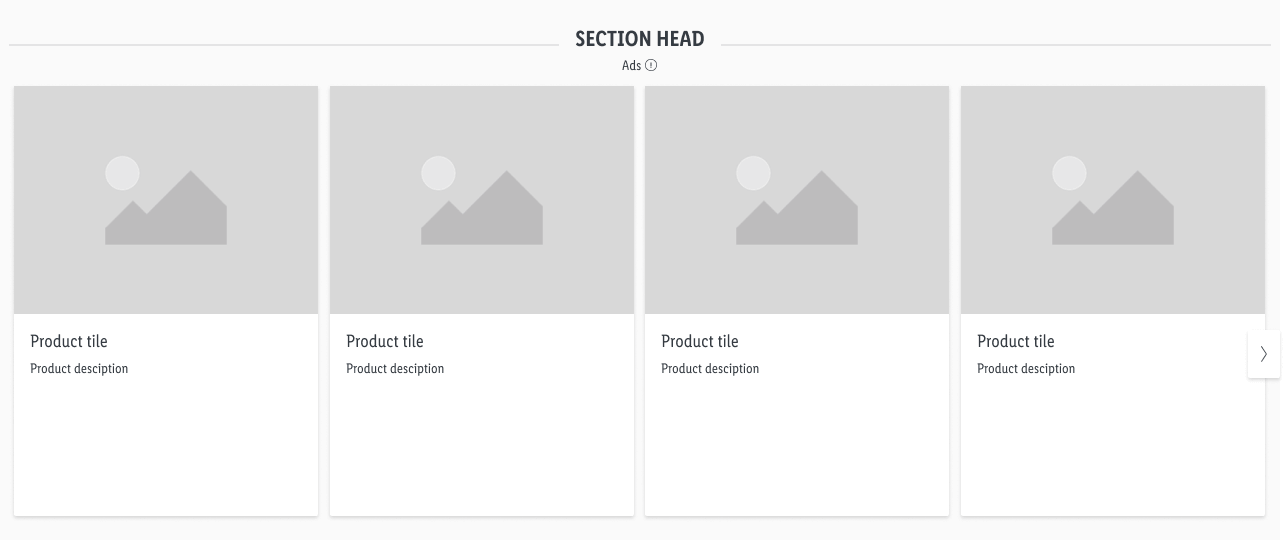 From legal perspective it is necessary to use the plural form of the text, so that it is clear that all products in the slider are ads. |
| Product tile ad | 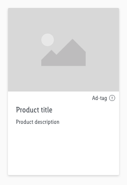 |
Our workflow in Sketch#
- Use the "Overrides"-function to customize your ad-tag symbol (i.e. enter text, with-icon or none icon, choose background color).
Change log#
Changed#
Doc: "Ad-tag" | Legal popover explanation and updated reco slider example
Changed#
Doc: "Ad-tag" | Example reco slider with section head


