Footer
Use the footer to help the customer with additional information and navigation at the bottom of a website.
Recommendations#
- Keep the footer as short as possible. Do not load it with unnecessary information. The customer is interested in a first glance.
- Ideally, important links will be opened via a new window or a tab in the browser.
Elements#
The default footer contains the following elements:
- Headline
- Main-Navigation
- Divider
- Meta-Navigation
- Background
Usage of elements#
| Headline | Main-Navigation | Meta-Navigation |
|---|---|---|
| This element is not absolutely necessary for the setup of a footer, unless you want to title or organize your main-navigation categories. | Use it to show a summary of all possible links or menus on a LIDL website (i.e. sitemap, wishlist, shopping cart, account, ...). | For information, such as legal (imprint, terms and conditions, data protection, ...) or contact, which must be placed on a website. |
Overall styling#
- The text-color always is basic-white.
- The background-color is always gray-base.
- The divider width depends on the breakpoint but has always a height of 1px and the color gray-lighter.
- The line-height is set to default.
| Types | Attributes | Preview |
|---|---|---|
| Headline | text-style: headline 5 |  |
| Main-Navigation | text-style: basic |  |
| Meta-Navigation | text-style: basic |  |
Status styling#
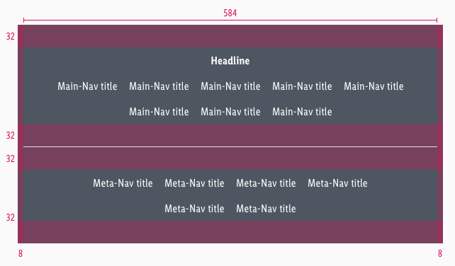
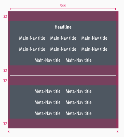
Spacing & measurements#
Overall spaces#
Element spaces#
Variants#
Alternatively, the footer can be arranged in columns instead of rows. This happens only for the desktop and tablet (landscape) breakpoint and if there are 3 rows or more in the main-navigation. The main-navigation always extends over 2 columns including Gutter and can add itself infinitely downwards.
What can be modified?#
- Override the text.
- Adjust the width of single symbols according to the text.
- Add rows or columns.
- Switch between the two possible layouts (vertically or horizontically).
- Modify footers for your project needs by adding other symbols (i.e. input fields, badges, buttons, …).
Our workflow in Sketch#
- Use the „Overrides“-function to edit the content of the symbols:
- main-navigation
- meta-navigation
- headline
Change log#
Changed#
Sketch,Doc: "Footer" | Adjusted to new grid settings
Removed#
Doc: "Footer" | Removed danger hint text for the spacing and measurements
Changed#
Sketch,Doc: "Footer" | Adapted component to new grid settings and marked documentation with deviating measurements
Changed#
Doc: "Footer" | Clean up the documentation for the right structure and sentence case
Changed#
- "Footer" | Changed symbols: with layer-style settings
Fixed#
- "Footer" | Fixed symbols: wrong smart layout and states
Fixed#
- "Footer" | Fixed symbols: wrong padding
Changed#
- "Footer" | Changed symbols to new smart layout of Sketch


