Grid system
A grid system can be used to align and size objects within a given format.
Usage#
- Basic rules that help you set up your pages in sketch.
- The responsive behavior of our grid has four breakpoints.
- The amount, width and spacing of the columns change with each breakpoint.
- Exception! The global header and footer live outside the bounds of the grid.
| 1. Columns | 2. Gutters | 3. Margins |
|---|---|---|
| Content is placed in the areas of the screen that contain columns. The number of displayed columns is determined by the breakpoint that is choosen. | Gutters are the spaces between columns. They help separate content and have a fixed value of 16px for all breakpoints. | Margins are the space between content and the left and right edges of the screen. They have fixed values for XS, SM and MD breakpoint and flexible values for LG breakpoint. |
Design breakpoints#
| XS | SM | MD | LG |
|---|---|---|---|
360-599px | 600-959px | 960-1279px | 1280-XXXXpx |
Settings in Sketch#
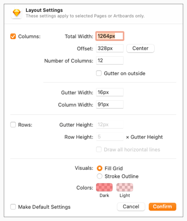
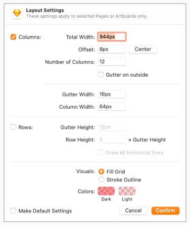
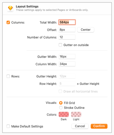
| Artboard | LG | MD | SM | XS |
|---|---|---|---|---|
| Viewport | 1920px | 960px | 600px | 360px |
| Columns | 12 columns | 12 columns | 12 columns | 4 columns |
| Gutters | 16px | 16px | 16px | 16px |
| Offset (Margins) | 328px / 328px | 8px / 8px | 8px / 8px | 8px / 8px |
| Layout settings |  |  |  |  |
Change log#
Added#
Doc: "Grid system" | Added design breakpoints
Changed#
Sketch: "Grid system" | Changed grid settings
Changed#
Sketch,Doc: "Grid system" | Changed grid settings
Changed#
Doc: "Grid system" | Clean up the documentation for the right structure and sentence case
Added#
- "Grid system" | Added page: grid system to "Web"
Removed#
- "Grid system" | Removed page: grid system from "Core"
Fixed#
- "Grid system" | Fixed description: incorrect information for "artboards" and "viewports"
