Popovers
This component is a pop-up box that appears when the user hovers over an element.
General information#
- It appears on click for mobile devices.
- To hide the pop-up box, the user simply clicks anywhere on the screen except for the popover itself.
- It is only displayed on demand and helps the user with additional detailed content, for example, important secondary information that are contextual.
Recommendations#
- Rather use a short text in a popover than an image.
- Use a popover to help the user complete tasks such as the ordering process or filling out a form.
Overall styling#
- The text-style is small.
- The line-height is set to default.
- The font color is gray-darker.
- The background color is gray-background.
- The outline color is gray-lighter.
- The border has a thickness of 1px.
- The components has rounded corners of 2px.
- It uses the shadow-default.
- The height and width depends on the content.
- The arrow on the popover can be set to different positions.
Variants#
Top#
- The arrow pointing to a component is at the top.
Bottom#
- The arrow pointing to a component is at the bottom.
Left#
- The arrow pointing to a component is on the left side.
Right#
- The arrow pointing to a component is on the right side.
Spacing & measurements#
| Types | Attributes | Preview |
|---|---|---|
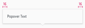
| Horizontal spacing | padding: 16px |  |
| Vertical spacing | padding: 16px |  |
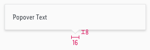
| Arrow size | width: 16px height: 8px |  |
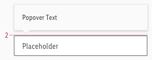
| Offset | distance: 2px |  |
What can be modified?#
- Override the text.
- Modify popovers by changing the colors of background, outline and text to corresponding additional colors (i.e. like danger, success, info, …).
Our workflow in Sketch#
- Use the „Overrides“-function to select the required variant and to edit the content.
Change log#
Changed#
Doc: "Popover" | Clean up the documentation for the right structure and sentence case
Changed#
- "Popover" | Changed symbols: with layer-style settings
Fixed#
- "Popover" | Fixed symbol: height of md-xs/left
Changed#
- "Popover" | Changed symbol: color of text from "gray-base" to "gray-darker"
Fixed#
- "Popover" | Fixed symbol: resizing of top- and bottom-center (LG)
Changed#
- "Popover" | Changed symbols to new smart layout of Sketch
- "Popover" | Changed symbols with layer styles


