Floating action button
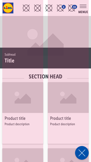
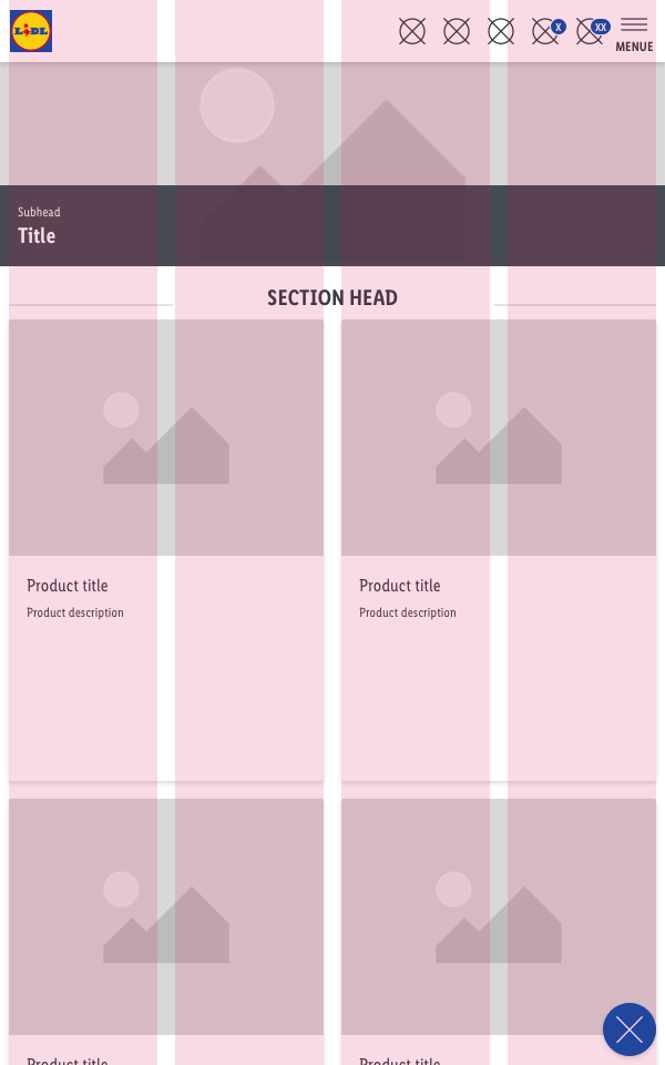
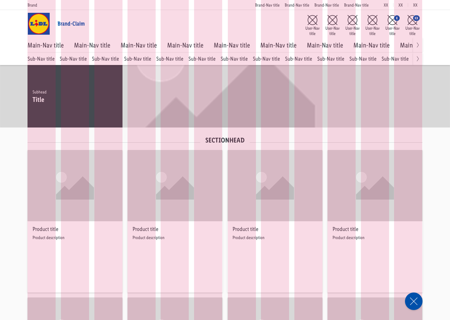
A sticky button that floats over the content of the page. It always has the highest level of emphasis on the screen.
It supports the primary navigation and offers the user a fast option to navigate.
Recommendations#
Do's#
- Please ensure that the floating action button has a positive function (e.g. open a menu, share, more, etc.).
- Choose an icon that refers to the content behind the interaction with the button.
- Use the floating action button only once per web site.
- Use the button efficiently in the layout. Content such as image galleries, shopping basket, etc. does not suit the floating action button.
Dont's#
- Don’t overlay the floating action button with additional elements like badges.
- Don’t use the floating action button for negative functions (e.g. delete).
- Don’t change the shape of the floating action button.
Overall styling#
- The component always comes in the shape of a circle.
- It uses the shadow-default.
| Types | Attributes | Preview |
|---|---|---|
| Default | background: brand-primary-base icon-color: basic-white |  |
| Hover, focus and active | background: brand-primary-darker icon-color: basic-white |  |
Spacing & measurements#
- The button comes in one size for every viewport.
Position & usage#
- The optimal position for the floating action button is the lower right corner.
- This area is easily reachable for the user.
- Alternatively, it can also be placed in the lower middle or left.
What can be modified?#
- Change the icon.
Change log#
Changed#
Doc: "Floating action button" | Changed color description for hover-focus-active state
Changed#
- "Floating action button" | Changed symbols: with layer-style settings


