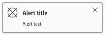
Alerts
Different types of notifications with contextual feedback about user actions as well as permanent presentation of important information.
General information#
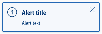
Our "info" alert matches our brand-primary color. Blue is the best color to demonstrate an "info" alert from UX point of view, in our case and in online studies. Part of the LIDL brand colors is "blue" and also the "brand-primary-color" on a digital device. It didn't make sense to create a new color "blue" for an "info" purpose. That's why the "brand-primary-color" for LIDL matches the "info" color. But if, for example, the "brand-primary-color" for LIDL will change, only the components using the "brand-primary-color" will change. This has the benefit that all info elements will stay "blue".
Recommendations#
- Keep the alerts text as short as possible. Especially the title.
- Use an alert, i.e for feedback, product recalls or support.
- Use links in the alert with caution. It might be more appropriate to link the entire alert instead of one word.
Overall styling#
- The text style is large bold for the title and basic for the text.
- The line-height for the "alert title" is 120%, it stays 140% for the "alert text".
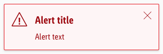
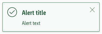
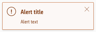
- Every variant uses the darker-color as text- and icon-color.
- The outline comes in base-color.
- The alert background always is the main-color's background-color.
- The border has a thickness of 1px.
- The components has rounded corners of 2px.
- It uses the shadow-default.
- All widths are individually adjustable and fit into the layout columns and the 8-point-grid.
- The height depends on the content and the additional components shown.
- Every alert comes with the icon "cross" as "close" -icon in the right upper corner.
- The color of the icon "cross" stays the same in the focus/hover state. Only the cursor changes to pointer.
Title & icon#
- Some alerts come with an additional fixed icon to emphasize their meaning.
Text#
- Simple alerts to only display text.
Link#
Some alerts use links to direct the user to another page.
- Every variant uses the darker-color as text-color.
- In the default/hover/focus state the text-decoration is underline.
| State | Attributes | Preview |
|---|---|---|
| Default / visited | 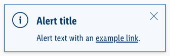 | |
| Hover / focus | cursor: changes to pointer |  |
| Active / pressed | text-decoration: none | 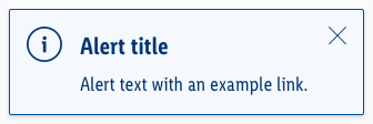 |
Spacing & measurements#
| Types | Attributes | Preview |
|---|---|---|
| Horizontal spacing | padding: 16px | 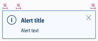 |
| Vertical spacing | padding: 16px margin-bottom: 8px |  |
| Icon size | meaning: 32x32px close: 16x16px |
Specials#
- Alerts can also be used in their brand-primary color besides or with just a different meaning to the „info“-alert (i.e. „brand-primary“ or „wine“).
What can be modified?#
- Override the text and icons.
- Adjust the width and height according to the content.
- Modify alerts to your project needs by adding other symbols or styles (i.e. like dividers or links).
Our workflow in Sketch#
- Use the „Overrides“-function to select the required variant, to edit the content, to change the icon if necessary or if the alert can’t be closed.
Change log#
Changed#
Sketch: "Alert" | Adjusted to new grid settings
Changed#
Sketch: "Alert" | Adapted component to new grid settings
Changed#
Doc: "Alert" | Clean up the documentation for the right structure and sentence case
Fixed#
Sketch,Doc: "Alert" | Line-height for alert-text has been set to 140% and documentation has been updated
Changed#
- "Alert" | Changed symbols: with layer-style settings
- "Alert" | Changed symbols: with radius symbol
Added#
- "Alert" | Added description: line-height
Added#
- "Alert" | Added description: primary
Fixed#
- "Alert" | Fixed symbols: wrong background size and position
Added#
- "Alert" | Added description: styling of closing cross
Added#
- "Alert" | Added description: styling and usage of links
Fixed#
- "Alert" | Fixed symbols: resizing and override function
Changed#
- "Alert" | Changed symbols: color of text and icon to "darker"; color of outline to "base"
- "Alert" | Changed description of "info": color of outline from "brand-primary-base" to "info-base"
- "Alert" | Changed symbols to new smart layout of Sketch
- "Alert" | Changed symbols with layer styles
Changed#
- "Alert" | Changed symbols: color of text, outline and icon to "dark"
