Header
The header is one of the essential components to create brand awareness.
The appearance symbolizes customers that they are on a LIDL page now. Its strongest supporting element is the LIDL logo with the brand claim.
Recommendations#
- Keep the globally known LIDL Logo in the header.
- Only change the brand claim regarding to your country.
Elements#
- The structure of the header is modular.
- It is a group of symbols and typography from the Core and UI Kit.
- If you combine the individual elements in Sketch, you get the header in various forms and for each breakpoint.
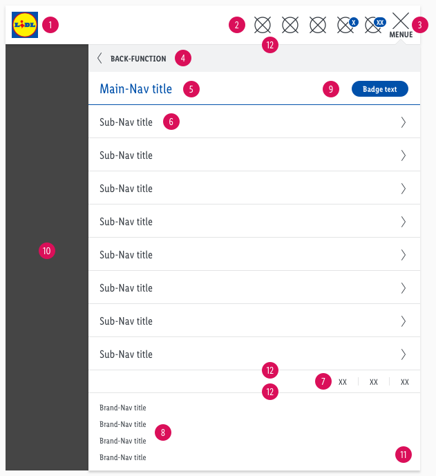
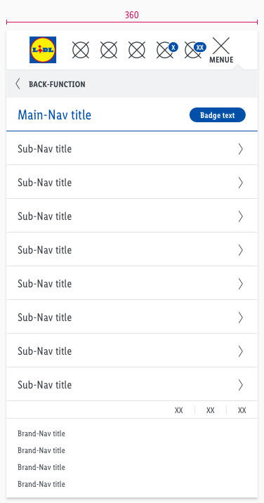
- There is a separate header layout for tablets (portrait) and smartphones:
- A burger icon opens a dropdown menu with the main- and sub-navigation.
- In combination with the back-function, our structure allows you to display an endless number of sub-navigation items.
- The header contains the logo, typography: main-, sub-, brand- and user-navigation, as well as colors and shadows.
- The header comes with a background-color in basic-white.
- It uses the shadow-default.
Desktop & tablet landscape (LG & MD)#
| Brand-navigation | User-navigation | Main-navigation | Sub-navigation |
|---|---|---|---|
| 1. Brand 2. Brand-navigation 3. Language 11. Divider | 4. Logo 5. Brand-Claim 6. User-navigation | 7. Main-navigation 8. Slider button 11. Divider | 9. Sub-navigation 10. Slider button |
Tablet portrait & smartphone (SM & XS)#
| Header | Flyout | Others |
|---|---|---|
| 1. Logo 2. User-navigation 3. Burger-menu | 4. Back-function 5. Main-navigation 6. Sub-navigation 7. Language 8. Brand-navigation 9. Badge 12. Dividers | 10. Overlay 11. Flyout |
Main- & sub-navigation#
- There are different types of use for each section of the navigation.
- Use the main-navigation for services that LIDL has to offer in your country (e.g. branch or special offers, online shop, travel, recipes …).
- Use the sub-navigation if a service has subitems (e.g. online shop with subcategories such as bicycle, fashion, household & kitchen …).
Desktop & tablet landscape (LG & MD)#
- The text-style for main-navigation is large.
- The text-style for sub-navigation is basic.
- The line-height is set to default.
- The background-color is basic-white.
- The indicator is displayed in a different color for each state.
- The length of the indicator is based on the entered text.
- Its position is at the bottom of the element.
| Types | Attributes | Preview (LG & MD) |
|---|---|---|
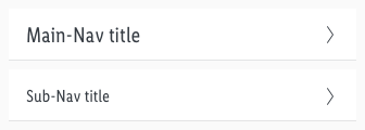
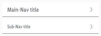
| Default | text-color: gray-darker indicator: none |  |
| Hover / focus | text-color: gray-base indicator: gray-base |  |
| Active | text-color: brand-primary-base indicator: brand-primary-base |  |
Tablet portrait & smartphone (SM & XS)#
- The text-style for main-navigation is large.
- The text-style for sub-navigation is basic, except the active state which is analog to the main-navigation.
- The line-height is set to default.
- The background-color is basic-white.
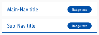
- The active main- & sub-navigation use a small linked badge-standard in brand-primary.
- The divider is displayed in a different color for each state.
- The length of the divider is the full width of the component.
- Its position is at the bottom of the element.
- The icon always is our "arrow-right".
User-navigation#
- This area is for user guidance with support of icons.
- The most important elements for the user should be placed here (e.g. shopping cart or wishlist, leaflets, newsletter registration …).
- Keep the title of the user-navigation as short as possible.
- The title can be used in a two-line scenario, but should never be exceeded.
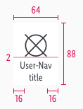
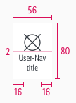
- The width of the component can be extended for the individual projects requirements.
- The icon is always centered above the text.
- The header has to be adjusted if the text for the title gets longer than specified as in our default component.
- Please ensure that the distance between the elements (icon and text) always stays the same.
- It uses the badge-addon to display a counter (e.g. how many products are in the shopping cart or wishlist).
Desktop & tablet landscape (LG & MD)#
- The text-style is small.
- The line-height has 120%.
- The background-color always is basic-white.
| Types | Attributes | Preview (LG & MD) |
|---|---|---|
| Default / active | text-color: gray-darker icon-color: gray-darker | 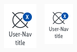 |
| Hover / focus | text-color: brand-primary-base icon-color: brand-primary-base | 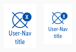 |
Tablet portrait & smartphone (SM & XS)#
- It only uses an icon to symbolize a user-navigation category.
- The background-color is always basic-white.
| Types | Attributes | Preview (SM & XS) |
|---|---|---|
| Default / active | icon-color: gray-darker |  |
| Hover / focus | icon-color: brand-primary-base |  |
Burger-menu#
- The text-style always is small bold and uppercase.
- The line-height is set to default.
- The background-color is always basic-white.
- Use this element only for tablets (portrait) and smartphones to demonstrate the main- and sub-navigation.
- In contrast to the user-navigation, a text is shown – limited to 5 letters.
- It uses our "bars-horizontal" icon to display a burger menu.
- The burger changes to our "cross" icon as a close function.
Brand-navigation#
- The text-style is small.
- The line-height is set to default.
- Some LIDL countries have special pages to present their company (e.g. FAQ, responsibility, career …).
| Types | Attributes | Preview (LG / MD-XS) |
|---|---|---|
| Default | text-color: gray-darker background-color: basic-white |  |
| Hover / focus | text-color: gray-darker background-color: gray-lighter the text gets underlined |  |
Language#
- The text-style is small and uppercase.
- The line-height is set to default.
- The active state comes with a round indicator in brand-primary-base and 1px outline in basic-white.
- Required by countries that have to offer variants of the LIDL website in different national languages (e.g. Switzerland or Belgium).
Back-function#
- The text-style is small bold and uppercase.
- The line-height is set to default.
- The recommended icon is arrow-left.
- There is no hover/focus or selected state.
- Use this element only for tablets (portrait) and smartphones.
- The user can go back to the previous navigation level by clicking on the link.
| Types | Attributes | Preview |
|---|---|---|
| Default | text-color: gray-darker background-color: gray-lightest icon-color: gray-darker |  |
| Example | Example of „back-function" on the symbol „dropdown-menu“ | 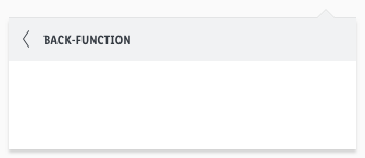 |
Brand#
| Types | Attributes | Preview (LG & MD) |
|---|---|---|
| Default | text-style: small | |
text-color: gray-darker |  |
Brand-claim#
- This element only exists in desktop and tablet (landscape).
| Types | Attributes | Preview (LG & MD) |
|---|---|---|
| Default | text-style: brand claim text-color: brand-primary-base position: horizontally centered with logo |  |
Divider, overlay & flyout#
- Dividers are used in every breakpoint and therefore have different widths.
- The overlay and flyout component only exists in tablet (portrait) and smartphone devices.
| Types | Attributes | Preview |
|---|---|---|
| Divider | color: gray-lighter height: 1px |  |
| Overlay | background-color: basic-black opacity: 72% |  |
| Flyout | background-color: basic-white shadow: default-flyout | 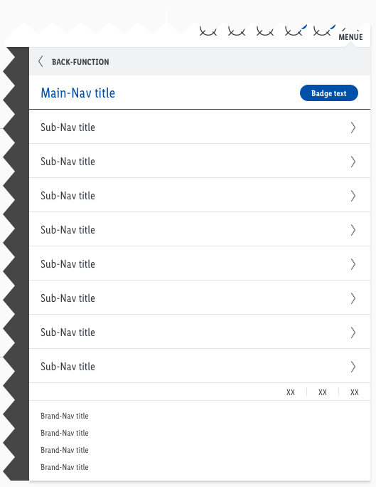 |
Spacing & measurements#
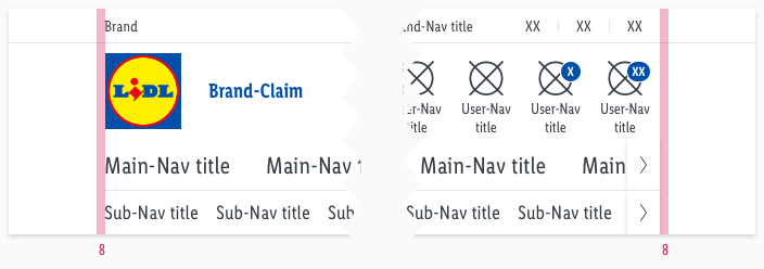
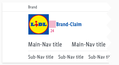
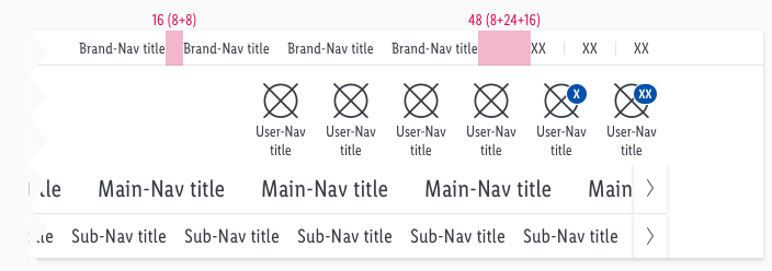
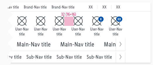
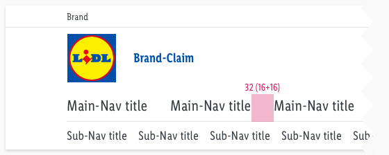
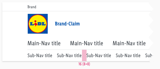
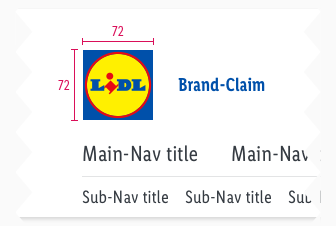
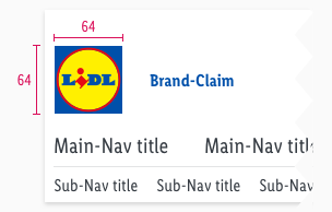
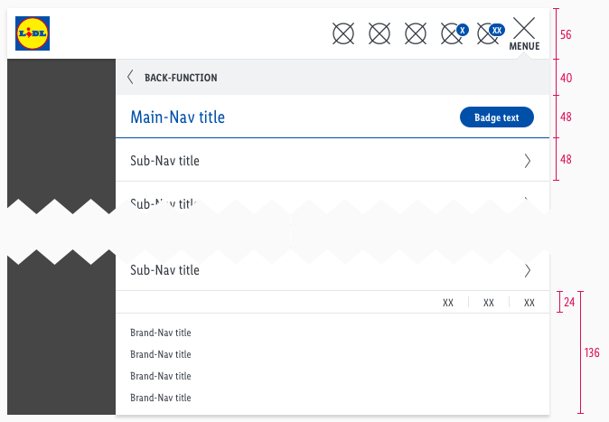
- This section shows the different spacings of the desktop and mobile elements included in the header.
Desktop & tablet landscape (LG & MD)#
- All the spacing for these breakpoints are identical.
- Only the height and width of the used components are different.
Spacing#
Measurements#
Tablet portrait & smartphone (SM & XS)#
Spacing#
| Types | Attributes | Preview |
|---|---|---|
| Content | padding: 8px |  |
| User-navigation | padding: 16px (8+8) |  |
| Brand-navigation | padding: 8px |  |
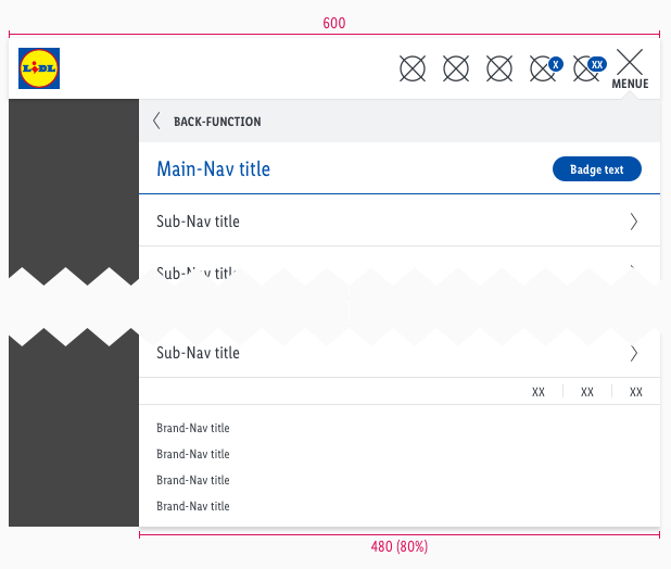
Measurements#
Position#
| Types | Attributes | Preview |
|---|---|---|
| Addon | padding-right: 8px (LG+MD) padding-right: 0px (SM+XS) |    |
| Language selection | padding-right: 10px (LG) padding-right: 10px (MD-XS) padding-top: 8px (LG) padding-top: 6px (MD-XS) |   |
What can be modified?#
- Override the text and icons.
- Adjust the width of single symbols according to the text.
- Adjust the height if you delete navigation sections (i.e. main- or sub-navigation).
- Modify headers for your project needs by deleting single symbols or special sections (i.e. language or user-navigation section).
Our workflow in Sketch#
- To individualize the header in your product you need to detach/unlink the complete symbol from the LIDL CAKE UI Web kit.
Change log#
Changed#
Sketch,Doc: "Header" | Adjusted to new grid settings
Removed#
Doc: "Header" | Removed danger hint text for the spacing and measurements
Changed#
Sketch,Doc: "Header" | Adapted component to new grid settings and marked documentation with deviating measurements
Fixed#
Sketch: "Header" | For MD a smart layout fix for main-nav title and sub-nav title
Changed#
Doc: "Header" | Clean up the documentation for the right structure and sentence case
Changed#
- "Header" | Changed symbols: with layer-style settings
Changed#
- "Header" | Changed description: width from "480px" to "600px" (SM)
Fixed#
- "Header" | Fixed symbol: Brand-Claim (MD) color from basic-black to brand-primary-base
- "Header" | Fixed assets: Brand-Claim (MD) Preview Images color from basic-black to brand-primary-base (Images: Brand-Claim & Measurements of Brand-Claim)
- "Header" | Fixed overlay: opacity from "50%" to "72%"
Changed#
- "Header" | Changed symbols to new smart layout of Sketch
Changed#
- "Header" | Changed symbols of user-navigation: height from "80px" to "88px" (LG); height from "72px" to "80px" (MD)
- "Header" | Changed symbols of complete header: height from "200px" to "208px" (LG); height from "168px" to "176px" (MD)
- "Header" | Changed symbols of user-navigation
Added#
- "Header" | Added symbol to main- and sub-navigation: badge-standard/small (SM/XS)
Changed#
- "Header" | Changed text-style of subnavigation: active state from "basic" to "large" (SM & XS)
Fixed#
- "Header" | Fixed symbols of brand-claim: wrong margin-left
- "Header" | Fixed symbols of brand-navigation: wrong naming (MD-XS)

