Logo
The logo gives a visual representation of your company brand.
General#
- The LIDL logo has a great recognition value and serves as a foundation for the visual identity of our brand.
- The combination of clear forms and strong colors symbolize strength, diversity and price competitiveness.
- The logo is unchangeable.
- The color highlighting and the slanted position of the "i" in the lettering emphasize the fresh and surprising character of LIDL.
Logo RGB#
- The logo is the most important recognition element of the LIDL brand.
Protection zone#
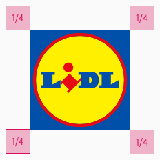
- In order to guarantee the integrity of the LIDL logo, we establish a protective zone that is free of visual disturbances and distractions.
- No other graphic or typographic elements should be placed in this protection zone.
- Even image elements in the background should be reassured.
- The protection zone is 1/4 of the logo width.
Change log#
Changed#
Doc: "Logo" | Clean up the documentation for the right structure and sentence case

