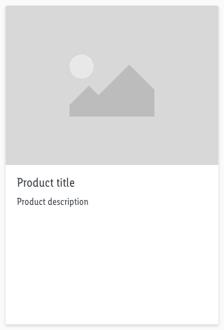
Product tile
Each product is presented with the product tile.
The product tile is a basic component which can be combined with other components (e.g.: price-fields, ribbons, availabilities, etc).
Recommendations#
- Ideally, the product title should be single-line or a maximum of two lines.
- The look of the default product tile is not mandatory. We only deliver a default product tile that can be modified to your projects needs.
- Change the text styles for your project needs but please stick to the given text styles of CAKE.
Overall styling#
- The text style of the product title is basic.
- The text style of the product description is small.
- The line-height is 120%.
- The image ratio always is 4:3.
- The components has rounded corners of 2px.
- Every state uses the shadow-default.
- The height of the white area depends on the content and the additional components shown.
- All widths are fixed and aligned to the layout grid of the breakpoints.
- The width of the component is divisible by 8 and equal to the image-width.
Spacing & measurements#
| Types | Attributes | Preview |
|---|---|---|
| Image size | Always ratio 4:3 | 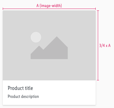 |
| Overall Padding | LG - SM: 16px XS: 8px | 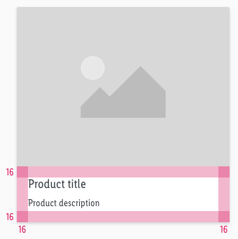 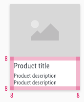 |
| Padding title to description | LG - SM: 8px XS: 4px | 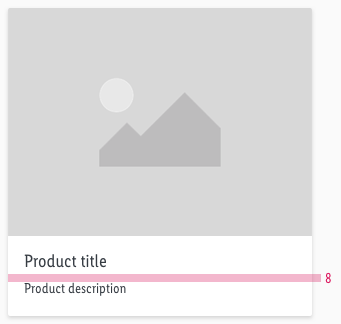 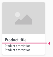 |
Position#
| Types | Attributes | Preview |
|---|---|---|
| LG | 4 tiles with width over 12 columns |  |
| MD | 4 tiles with width over 12 columns | 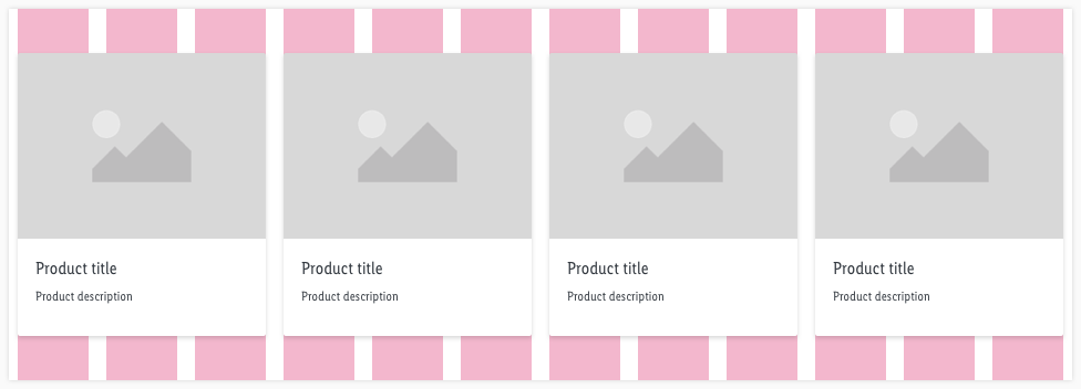 |
| SM | 2 tiles with width over 12 columns | 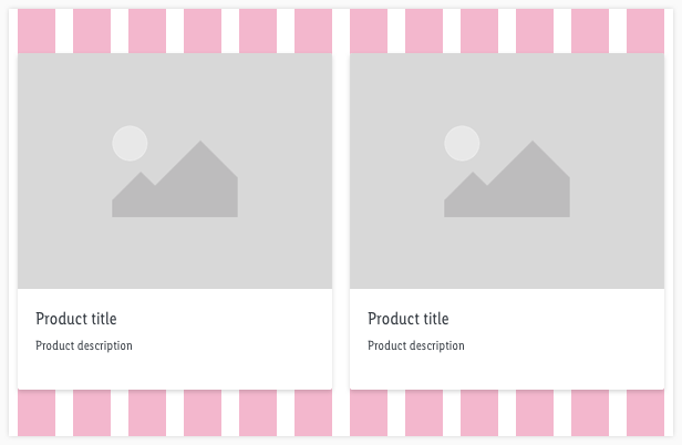 |
| XS | 2 tiles with width over 4 columns | 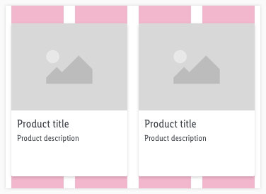 |
What can be modified?#
- Override the text and image.
- Adjust the height.
- Change the text to a two line scenario.
- Modify product tiles to your project needs by adding other symbols to the product tile (i.e. ribbons, priceboxes, product ratings, badges).
Our workflow in Sketch#
- To change the text or image use the "Overrides"-function.
- Place additional elements like the pricebox element on top of the product tile and resize the height.
Change log#
Changed#
Sketch,Doc: "Product tile" | Adjusted to new grid settings
Changed#
Sketch: "Product tile" | Adapted component to new grid settings
Changed#
Doc: "Product tile" | Clean up the documentation for the right structure and sentence case
Changed#
- "Product tile" | Changed symbols: with layer-style settings
Added#
- "Product tile" | Added description: line height to overall styling
Added#
- "Product tile" | Added description: text style use, column width, number of product tiles
Changed#
- "Product tile" | Changed symbols to new smart layout of Sketch
Added#
- "Product tile" | Added description: position
