Pagination
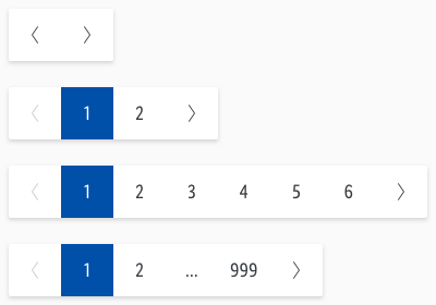
Pagination is used to spread content or data over multiple pages.
It allows the user to jump to the respective pages by browsing.
Recommendations#
- Use the provided pagination as the simplest and smallest solution.
- The complete pagination can be placed either left, centered or right on a web page.
- It can also be placed above or below the page content.
Overall styling#
- The text-style always is basic.
- The line-height is set to default.
- The background is basic-white with a shadow-default.
- The whole element has rounded corners with a 2px radius.
- Use „arrow-left“ and „arrow-right“ as icons.
- Only arrows can be disabled!
- The width depends on the number of shown digits or arrows.
- It is only scalable by adding up the digits or arrows.
Spacing & measurements#
Spacing#
Measurements#
Usage#
- This section shows the usage of active arrows depending on the page shown to the user/customer.
| Types | Attributes | Preview |
|---|---|---|
| Right | more than one page first index is shown |  |
| Both | more than one page middle index is shown |  |
| Left | more than one page last index is shown |  |
Variants#
- You can create more or less digits.
- Just detach the symbol to define your own element.
What can be modified?#
- Override the digits.
- Modify paginations for your project needs by adding or deleting single pagination symbols (i.e. like more digits or more arrows).
Our workflow in Sketch#
- Change the states of indexing and arrows using the "Overrides"-function.
Change log#
Changed#
Doc: "Pagination" | Clean up the documentation for the right structure and sentence case
Changed#
- "Pagination" | Changed symbols: with layer-style settings
Fixed#
- "Pagination" | Fixed description: icon-color from gray-lighter to gray-light


